Affinity Photo - Design Project: Enigma Lounge
Key Takeaways
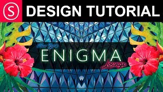
The video demonstrates a design project in Affinity Photo, showcasing the creation of the Enigma Lounge design from start to finish, utilizing various tools and techniques such as layer manipulation, text placement, and blend modes.
Full Transcript
today we are going to create a design project hello my friends and let's get started some of my supporters asked me to show them how to create a project from the start to the end so I will do this today and we will start with a smaller project with it which is a design for an event so I have this kind of texture here in the background I selected from the internet and I have another picture which are these flowers they are originally vector but I converted them to pixel for this picture and we will use this the first thing I want to tell you about this is the reason why I selected this because it introduces a very nice contrast because you have on the one side the exotic flowers with the nature and the soft textures and in the background you have this harsh sci-fi kind of halt metal looking structure so this is a nice and interesting contrast so let's create this into an interesting design the first thing I'm going to do is use the background to create some symmetry so let's zoom out and I will rotate this by 90 degrees or maybe the other side let's take the other side and we will find the middle of the picture so go here to view and say show rulers this is important so you can drag out from the side one of your help lines there we go and when it starts to become green this means that's the middle of your picture that's the middle of your canvas so we're gonna use that as an orientation and I will push this to the middle and it should snap if it does not snap go up here where it says you and go to snapping manager and see here it should snap to guides so this should be hooked and up here and I will snapping should also be hooked okay now we're gonna back to the lair and duplicate the layer that's important make a duplicate and the duplicate we are going to arrange up here and then to flip horizontal BAM so this will just be mirrored to the other side and we'll just move it to the other side and you can see we have red line and a green line which means we're in the middle of the picture and in the middle of the layer from the height in the pictures or this is centered and we already have a very interesting composition which also looks a little bit like a room let's select both layers and then hit ctrl key to create a group so we can call this BG for background so we have this saved and you might see here's a white line which is a problem from the software because if you zoom in there is no white line what we can do about that is just duplicate our group duplicate here and then rasterize it which will also reduce the size and now you can see the line is gone this is very helpful for us the next thing we can do is use the flowers to arrange them in a very interesting way let's maybe pull them down here we can also make them bigger let's see we have to have some place left for the texts but we could put them here I can rearrange them later it's not really a problem but let's go with this I will duplicate that also there we go duplicate and again arrange and flip Hortis on horizontally there we go and then we move it over to the other side to similar position you can hold shift so it's moving just in a straight line and not up and down so let's see should be around here should be good okay because there is a lot of stuff going in on in the background what we need to do if we want to put a text here is or at least this is a trick that I often use is to create just a black box in the background there we go this is white right now it will turn in black in a second one moment there we go make it full size and we can set this to black there we go and another thing you can do that will make this a little bit smoother is let's reduce pass a t2 for example 25% and then we will duplicate it and we will make the second one a little bit smaller just a tiny bit down here up here so there we go and we will maybe heighten the opacity a little bit let's see so it's like this for example so we can still see the background and now we have this little extra line here which makes it a bit more interesting we can still make this also a bit darker take a little bit back from the other one so like this okay so now we have some interesting elements let's group the flowers too and group these boxes and always write a name so this is the black box so you find your layers later on and this is the flowers and now you can also click the group and click up here where is the least a small lock icon so you can lock the layer so you're not going to move them by accident let's look everything and now we are just working with text so I will go over here and we will create the first text and there is another part of how to contrast things in your picture so I will call this a NEMA there we go there's nothing visible right now not sure why let's set it to white oh because it's behind the background there we go there we go okay that's good this is light what else do we have why do you like no light is good it's called open sans it's a free font open sense we will put that in the middle somewhere like this okay and then when we take another font for our picture and by the way you can select this and the group of well this and the group both layers holding ctrl and clicking on the two layers and then you can go up here to arrange and just click you to align vertically so the text will be in the middle of the box there we go okay and now when we take a second font which I will use up here to write lounge I want to use another font on let's see where is it a downloaded it today not the alien funds Ariel now this one here lounge okay that's good all right we will set this to black maybe let's see okay and I mean okay let's set it back to white so you can see it at the moment the reason why I choose this font oh wait I have to write it differently lounge like this yeah that's good okay you can see now that I have a font like this which is very plain and straight and abstract and there is not much to it and to contrast that I use a font that is very alive and calligraphic and artistic so it's always good to combine a font that is simplistic with a font that is artistic and not use two fonts that are artistic or two phones that are simplistic so this they will complete each other when they are from the opposite kind of choice okay let's set this up here and we will make some neon effects on the background so I will make this black and let's go to effects up here and say outer glow and we can set a nice color maybe a color we already have in our picture for example the nice pink from the flower and so we can color pick this from here and then just click on the color again so it's up here and now you can like set the radius to get a nice glow going in the picture like this and we can do the same thing with our other font there's the middle let's make maybe a green glow either a natural grow or or maybe a blue glow let's try this let's see how this looks mm not too bad let's try another color like green or yellow no maybe green that's that's good make it a little bit stronger there we go and let's see I want to have the background a bit darker let's make a complete black plane over the background there we go and I will just reduce the opacity to see if we find a value maybe that's giving us a more interesting design with the background or with the colors maybe also see what the blend modes if we find something that's interesting Hauser is soft light okay that's interesting it's nice maybe make an adjustment layer here for curves and have a little bit more contrast on it let's see okay reduce this a little bit so there's a lot of playing around and Wolf of how to how can I say find a look that is working for you you know okay next one and by the way is searching for all these kind of fonts and elements and stuff this can take a long time so really don't get too frustrated if you don't find them right away the cake can take a pretty long time to find the right combination but the better your material is the better your results will be for the final design and so don't I wouldn't waste too much time on trying to improve material that is bad rather start out by trying to find material that works for you and it's interesting enough for you let's see with the font if there is something else I mean I like open sans pretty much I would like to have something that's even thinner this one is kind of nice has a little bit of design to it just a tiny bit if we crushed it a little bit how does it look wait with ctrl T you can open the window for the font settings and here for example you can have the distance between the fonts you can change that you can see you can widen that a little bit you should go even more actually let's see 80 it's kind of nice maybe 90 that's let's go with 90 there we go let's push just a little bit deeper here should this I would like this to be a little bit bigger so you can see it better [Music] maybe have more glow on this what happens if i duplicate this is there the glow is duplicated - oh yeah that's more intense let's see make another color here second color make this second glow a little bit smaller so we have a kind of effect of changing light and it's kind of nice whoops okay that was not a good idea one second let's combine these two layers into a group okay should we do the same thing here and by the way we could also try here to create a white frame let's see outline set this to white make it a little bit of a white line no that's not good house yeah sorry one second I have to go back to the group and select the group as a whole let's push this up here maybe put this below it's kind of nice we could try to duplicate this one second let's duplicate this pull it over here change the text call it new I will lock this so we're not changing the other texture you and I want to give it a different color now should we take it maybe blue and the second one a darker blue okay there we go well maybe should we take this in green there's a little bit of playing back and forth to find the right solution and up here the effect is a little bit too strong whoop no don't zoom into that all right you see I want to put something up here to have kind of a balance of these elements because if I don't have this it kind of moves too much to the right side so probably it's kind of a good idea to have something up there let's get this in again and don't use too much phones decide on something and then stick with it because if you have too much phones it's kind of getting a little bit crazy wait a second of course this is just a fantasy kind of thing that I'm writing now right now so the real text would depend on what it's actually going on whoa why is this double now this is not good here we go both texts okay I'm not too happy with the blue up here sorry let's change this again let's pick some of the blue in the background where's a nice blue this is too kind of white let's check the other one make a darker blue for this kind of pinkish nope that's too white hmm let's go back in here make it a little bit brighter maybe here we go okay good I think I will leave it at that because it's also kind of a long tutorial already so you can see I try to balance the different elements in the picture and the different kind of design structures so combining a simple font with an artistic font combining and a sci-fi background with organic elements stuff like that and because there's so much going on in the picture to have this kind of black bar over everything to even it out and make the text more readable maybe make this text here a little bit smaller and stretch it even more from the font distance sorry 150 and another element that is pretty important especially when you work with text is to find a text and a font that looks good but at the same time has a higher readability because otherwise you have the problem that it looks really cool but nobody can read what you're actually writing so that's kind of a big problem there you go not a hundred percent happy with the design because as always you would sit down let it sink in for some time maybe a day or two and then get back to the design and look at it again but for the first stage basically for giving you an idea of the design process this is pretty good I think this really okay okay so thank you very much for watching maybe I do a second video in this improving this design write in the comments if you want to see some more work on this design and if you want to see more of my videos I do a new one every three day so you might want to subscribe and if you even want to support me head over to patreon where you can find other benefits like the original file with all the layers for example for this project okay see you soon and thank you for watching bye
Original Description
Today I'm showing you my design process with an example project. I show you every step I take and give you some valuable know-how about design concepts along the way. Have fun :)
Support me on PATREON and get my Affinity Photo File with all layers as a Thank You:
https://www.patreon.com/sarikas
Find me on Steemit:
https://steemit.com/@multi4g
Materials used:
https://www.dafont.com/atlantic-bentley.font?text=Lounge
https://www.freepik.com/free-vector/watercolor-tropical-plant_787418.htm
https://unsplash.com/photos/NFs6dRTBgaM
#design #club #lounge #scifi #organic #natural #exotic #photo #design #art #colorful #fun #dtube #artistic #creative #steemit #easy #tutorial #education #handson #learning #free #affinity #editing #episode #series #making #DIY #minute #quick #pictures #howto #designer #cover #elearning #video #online
Watch on YouTube ↗
(saves to browser)
Sign in to unlock AI tutor explanation · ⚡30
Playlist
Uploads from Olivio Sarikas · Olivio Sarikas · 43 of 60
1
 2
2
 3
3
 4
4
 5
5
 6
6
 7
7
 8
8
 9
9
 10
10
 11
11
 12
12
 13
13
 14
14
 15
15
 16
16
 17
17
 18
18
 19
19
 20
20
 21
21
 22
22
 23
23
 24
24
 25
25
 26
26
 27
27
 28
28
 29
29
 30
30
 31
31
 32
32
 33
33
 34
34
 35
35
 36
36
 37
37
 38
38
 39
39
 40
40
 41
41
 42
42
 ▶
▶
 44
44
 45
45
 46
46
 47
47
 48
48
 49
49
 50
50
 51
51
 52
52
 53
53
 54
54
 55
55
 56
56
 57
57
 58
58
 59
59
 60
60

Remove breathing sound from your audio recording // Audacity
Olivio Sarikas
Noise Removal for Audio Recordings - fast & easy // Audacity
Olivio Sarikas
In the Bazar - NI Maschine Audio Sketch
Olivio Sarikas
Submarine Concerto - NI Maschine Audio Sketch
Olivio Sarikas
Affinity Photo - Creating a Photo Font
Olivio Sarikas
Affinity Photo - Rusty Metal Font Tutorial
Olivio Sarikas
Affinity Photo - How to remove things from a photo
Olivio Sarikas
Affinity Photo - How to replace a Sky
Olivio Sarikas
Affinity Photo - How to put Patterns on Clothing
Olivio Sarikas
Affinity Photo - Vintage Look Tutorial
Olivio Sarikas
Affinity Photo - Photo Letter Font Tutorial
Olivio Sarikas
Affinity Photo - Print Ready Tutorial
Olivio Sarikas
Affinity Photo - Grunge Maps Tutorial
Olivio Sarikas
Affinity Photo - White Teeth Tutorial
Olivio Sarikas
Affinity Photo - Frequency Separation Tutorial
Olivio Sarikas
Affinity Photo - Double Exposure Tutorial
Olivio Sarikas
Affinity Photo - 5 Tricks for better Pics
Olivio Sarikas
Affinity Photo - Realistic Fog
Olivio Sarikas
Affinity Photo - How to Match Color
Olivio Sarikas
Bokeh Balls Trick - Affinity Photo Tutorial
Olivio Sarikas
Affinity Photo - Remove Fog, Smog, Haze and Dust
Olivio Sarikas
Affinity Photo - Orange & Teal Look
Olivio Sarikas
Affinity Photo - 5 MORE Tricks for better Pics
Olivio Sarikas
Affinity Photo - World in a Light Bulb
Olivio Sarikas
Affinity Photo - Watercolor Effect
Olivio Sarikas
Affinity Photo - 5 Tricks for better Composition
Olivio Sarikas
Affinity Photo - Fur Text Tutorial
Olivio Sarikas
Affinity Photo - Skin Color & Tan
Olivio Sarikas
Affinity Photo - Oil Paint Look Tutorial
Olivio Sarikas
Histogram explained EASY & FUN - Affinity Photo Beginner Tutorial
Olivio Sarikas
Affinity Photo - Text in Perspective
Olivio Sarikas
Affinity Photo - Dramatic Sky Colors
Olivio Sarikas
Why Black & White Photography is amazing!
Olivio Sarikas
Affinity Photo - Stunning Black & White Photos
Olivio Sarikas
Affinity Photo - 5 Filters for Landscape Photography
Olivio Sarikas
Affinity Photo - Remove Shadows EASY
Olivio Sarikas
Let's Talk - Where we go from here :)
Olivio Sarikas
Affinity Photo - Realistic Image on a Screen
Olivio Sarikas
Affinity Photo - 4 Perspective Tools explained
Olivio Sarikas
Affinity Photo - 3D Text Effect
Olivio Sarikas
Affinity Photo - Tilt Shift done right
Olivio Sarikas
Affinity Photo - Blur Filters Explained - Part 01
Olivio Sarikas
Affinity Photo - Design Project: Enigma Lounge
Olivio Sarikas
Affinity Photo - Fake Colorized Look
Olivio Sarikas
Affinity Photo - Tiny Planet Tutorial
Olivio Sarikas
Affinity Photo - Change Day to Night - Tutorial
Olivio Sarikas
Affinity Photo - Neon Text Tutorial
Olivio Sarikas
Affinity Photo - Wood-burn Effect
Olivio Sarikas
Affinity Photo - NEON Portrait Look
Olivio Sarikas
Affinity Photo - Angel Wings Tutorial
Olivio Sarikas
Affinity Photo - Remove any Logo
Olivio Sarikas
Affinity Photo - Portrait Design - SUPER EASY!
Olivio Sarikas
Affinity Photo - Make a Planet
Olivio Sarikas
Affinity Photo - Brushes Explained
Olivio Sarikas
Affinity Photo - Design your own Brushes
Olivio Sarikas
Affinity Photo - Flame Soccer Tutorial
Olivio Sarikas
Affinity Photo - How to save a bad Shooting
Olivio Sarikas
Behind the Scenes - Special Episode
Olivio Sarikas
Affinity Photo - Cyber Demon Tutorial
Olivio Sarikas
Affinity Photo - Red Riding Hood Project EP 03
Olivio Sarikas
More on: AI Productivity Tools
View skill →







Related Reads
📰
📰
📰
📰
Why AI Increases the Need for Platform Engineering
Dev.to AI
AI for CS Assignments: How I Survive Technical Writing (Without Completely Dreading It)
Dev.to AI
I built RepoLens: a repo docs, diagrams, security report & AI chat, from one knowledge graph
Dev.to · OnamSharma
Can we use AI for academic writing? It depends:
Medium · AI
🎓
Tutor Explanation

 DeepCamp AI