Figma – Full Course 2026
Skills:
UX Research70%
Key Takeaways
Builds UI/UX design skills using Figma, from beginner to confident designer
Full Transcript
Master the entire UIUX design workflow in this comprehensive six-hour course that takes you from Figma basics to professional-grade highfidelity prototyping through hands-on real world projects like travel and food delivery apps. You'll gain practical experience with advanced components, auto layout, and three elements to build a production ready design portfolio. Welcome to mastering Figma from zero to 100. If you are looking to elevate your design skills and create stunning functional projects, then you are in the right place. This course is crafted for everyone from complete beginners to advanced designers. Whether you are just starting your design journey or looking to refine your skills, we have got you covered. In this course, we will take you from the basics of design to mastering advanced tools in Figma. We will start with the introduction to the world of design where you will learn all the foundational principles. From there, we will dive into the Figma's interface and basic tools ensuring you have a solid understanding before moving on to the more complex topics. But we don't stop at the basics. We will guide you through a series of projects, each one designed to challenge and inspire you. You will work on beginner friendly projects, then progress to intermediate and advanced projects that are not just functional, but also beautifully designed. These projects will teach you the technical and creative aspects of design, helping you to build the portfolio that stands out. What makes this course truly unique is its neverending nature. We are committed to keeping you at the forefront of design trends and techniques. Every week, we will add a new project to the course, ensuring you always have fresh, up-to-date content to work with. You will never run out on opportunities to learn and grow. So, what are you waiting for? Join us today and start your journey towards mastering Figma. Enroll now. All right. All right. Namaste G. This is Vish and I'm super excited to be your guide and captain in this particular course. So this video is going to be a powerp packed video filled with golden nuggets where we are going to understand who is a designer, the role of a designer, skills and qualities that a designer needs to possess the design process, the impact of a designer in this world, how designers are changing the face of this world. Okay. And finally we are going to conclude with all of these sections. So I'm super excited for this video. Hope you are too. Let's get into this video. Now let's start by understanding who is a designer. Now at its core when we talk about designers, designers are basically the problem solvers. Now what do I mean by that? Designers use their creativity, technical skills and deep sense of human behavior. They need to possess all of these qualities. In order to come up with a solution that is both functional as well as aesthetically pleasing. So the solutions that they come up with it has to be functional. It has to be problem solving and it also since they are designers it also has to be beautiful. Now let's understand what is the what are the different roles of a designer as we have understood who are designers. Okay. So the roles now as you have heard there are different kind of designers right they are designers like graphic designers, web designers, product designers, UIUX designers, interior designers and so on and so forth. Now we have heard all of these terms in uh generally in our society. Okay, let's try to understand what these different kind of designers do in their day-today life. What are their roles? What part do they play in this society in this world? Okay. So, graphic designers they focus on the visual content of print and media. So, for example, they are into creating the logos, brochures, web, banners, advertisement. So, all of these things that you see in your day-to-day life is created by graphic designers. Okay. Now, let's understand what do web designers do. Okay. It's very simple. They design for the web. Okay. They create layout, visual appearances and usability of a website. Okay. And they you know ensure that the site is both functional, attractive as well as user friendly. Okay. Whenever you enter a website, it has to be functional. It the navigation has to be smooth. You shouldn't be stuck in a particular process. So we have to make sure the web designers have to make sure that your experience is a smooth experience. Okay. As well as it has to be a beautiful looking. It has to be aesthetically appeasing to your eyes. Okay. So that is a role of a web designer. Now what do we mean by a product designer? You might have heard this to term also very you know generally being used in this society. So they are involved in designing and development of a physical product. So any physical product uh ranging from electronics to furniture that you see in this no uh day-to-day life is done is created by product designer. Okay. So uh for example you know I have this I have this keyboard right now the design of this keyboard is basically designed by a product designer. Okay. So the layout of the keyboard, how many keys has to be there, the beautifification of this keyboard, it's a beautiful keyboard. Okay, wireless keyboard, right? So all of these different kind of intricate, soft, tiny products all the way ranging from electronics to furniture, everything is designed by product designer. Okay. And they also make sure that you know their design is functional at the same time it's beautiful looking. Okay. Now let's talk about who are UI and UX designers. Okay, this is one thing everything is conf everyone is confused about. Okay, who are the UI and UX designers? Now these designers basically they specialize in creating user interfaces and experiences. Okay, UX means user experience and UI means user interface. Okay. So they have to be uh you know efficient in creating intuitive as well as enjoyable app or website that they are designing. So they basically work on the digital aspect of the product ensuring that the interactions are smooth and satisfying. That is the role of UI and UX designers. Right? So who are interior designers? Now you may ask. Okay. They designed the interior space of the buildings focusing again on the functionality and aesthetic appearance to create a space that are both beautiful as well as practical. So these are some of the designers that you find in this world. Okay. And there are many types of other designers as well. I'm just you know we are just uh touch touching on few of the designers and as we move forward into this course we are going to talk about some more. Okay. Now let's understand what are the skills and qualities that a designer needs to possess. Okay. So there are various types of skills that a designer needs to possess. But these are the important ones. They have to be creative. They have to be technically sound in their skills. Okay. They have to have a sense of attention to detail. They have to have a quality of communication of smart and smooth communication. They should be a problem solver and they have to have the quality to empathize with the people around them for the product they are building for the people uh you know the product they are building for the people. So let's start with creativity, right? They have to have the ability to think out of the box. Okay? They have to have the ability to generate innovative ideas and think out of the box. Technical skills obviously they'll have to have a proficiency in all of their tools like Figma or Adobe Suits or any other tools that they are working in. Okay? They have to have a eye of attention to detail. uh they have to have a precision in creating clean, polished and professional designs. Communications, they have to have the ability to clearly convey their ideas effectively both visually as well as verbally. Okay. Problem solving. They have to be a problem solver. They have to understand the problem, think critically on the problem and come up with a solution that is effective and as well as appeasing to your appeasing to the eyes, beautiful to the eyes. Okay? And they have to have the ability to empathize, you know, they have to empathize and understand the emotion of the targeted audience, the user base or a group of people to create designs that truly resonates with the mass audience and solve their problem. Okay. So these are the skills and qualities that a designer needs to process. Okay. Let's talk about the design process. Okay. So design process basically uh covers in this five sections research and discovery, concept development, design and prototype, feedback and iteration, finalization and handoff. So these are the five design processes which we are going to talk in depth about in our coming videos. So you need not have to worry about that right now. Okay. Now finally let's understand what is the impact that a designer is creating in this world. Okay. Designers have created a significant impact in this world. Okay. They shape how we interact with products. How we perceive the brand? So any brand how do we perceive it? For example when we talk about Nike what do we think about Nike? And what do we think about any other product for that matter? Okay, give it a thought. You know, critical thinking, we are going to talk about in depth going further as well. Okay, but what do we think about Nike? What brings to your mind? I would like to know. I would like to hear. I would love to hear. Okay, please type it down in the comment section below. Okay, I would love to hear what are your thoughts. Give me different types of brand and what do you think about it. Okay, I would love to hear. So uh the way how we perceive the brand there is a brand story there's a complete psychology behind creating a brand and how we perceive touch and feel that brand the sense of understanding of a brand everything is created by with the help of a designer okay so how we experience a brand or a space it's very important okay that's where designers come into play I would I'd love to hear your thoughts. Okay. So, we are also going to cover good designs and bad design in our further topic. Okay. What are good designs and what are bad designs and what kind of designs should we choose in order to become a better designer. Okay. We are going to talk about that. So in conclusion, a designer is a multifaceted professional who blends creativity, technical skills and empathy to solve problem and create meaningful solution. This is a precise definition we can come up with. Who are a designers? Designers are multiaceted professionals who blend creativity, technical skills and empathy to solve problems and create a meaningful solution. So as we dive deeper into the course, you will gain the skills and knowledge needed to excel in the design field. All right. So that is it from this video. Namaste. This is Vish. I'll see you in my next video. Bye-bye and take care. Welcome, welcome. Thank you so much for enrolling into the course. This is your boy Vishnak and I'm going to be a guide and captain in this journey of mastering Figma from zero to 100. So without any further ado, let's get started with today's video. All right, first things first, what we are going to do is we are going to go to figma.com. And as soon as you log into this particular website, you get a bunch of options that you can work with. Okay, first things first, all you have to do is go to login. And if you already have a account available, you can login with that particular account. Otherwise, you can also log in with Google account as well. If you do not have any of these, go ahead and create a new account by clicking on create one. All right, I'm just going to X out of it. Now yes, Figma is available both in website as well as in a app application form. To download the application form, all you have to do is go ahead and click on these products link. It's going to give you a bunch of few more options. go to the downloads over here and again it's going to bring you to this particular page where you have a bunch of few more options that you can work with. So respectively if you want to download it for desktop you know uh if you have a Mac OS you can go ahead and click on this and you can go ahead and click on this if you have a Windows computer. All the best on doing that. Well, I have a Mac OS. So, what I'm going to do is going to go ahead and click on this particular link. As you can see, I have already downloaded it like a couple of times uh you know before making this video just to make sure that it's working properly and it's not breaking down. All right. So, just go ahead and open this folder and it's quite simple. It's the same way how you download all the other apps or install all the other apps into your respective personal computer. All you have to do is doubleclick on this and you can simply download it because I have already downloaded the app. But it's quite simple. These are the steps and by following these steps you can download the application into your computer. All right. So that is how you download Figma app into your computer. So that is it from this video. In the next video, we are going to get started with the introduction part of Figma. So I'll see you in my next video. Bye-bye. Take care. Wonderful. Welcome to the second video of mastering Figma from 0 to 100. This is your boy Vishna and today we are going to learn everything about file browser. So without any further ado, let's get into today's video. All right. So I have just fired up Figma. So the first time that you open up Figma, this is what you get. Okay, it's a new account that I have created just for this uh tutorial purpose. And this is what you get for the first time if you are opening the Figma. Okay, it has automatically created a team for me and I have got no projects because I haven't worked on any projects until now. It's a completely fresh page. uh you can click on this toggle over here and what you can do is I just want to rename this particular team. So I'm just going to rename it as wishious vicious team. Let's go ahead and commit on that and voila is going to rename my team. Now you can add multiple teams if you want to but for initial purpose I'm just going to work on this particular team. Okay. And we've got some more things that we can do. Now for example to add multiple teams all you have to do is click on this toggle and you can click on create new team. Let's go ahead and create one more team. So this one I'm going to name as Figma Udemy. Okay. All right. Perfect. And I'm going to create a new team. Am I going to add any collaborators? No, I'm going to work solo. So I'm not going to add any collaborator. Just click on skip for now. Now I come to this particular page where you can actually upgrade to a professional account but uh I'm just going to work with a starter kit. Okay. And in starter kit you have a usage limit of three files, three pages and one project. And the version history that is the backup uh will be available for 30 days. We are going to try it out and we are going to use this. And I think if you want to uh go with the professional, you can definitely go. It's going to cost you anywhere around $15. Okay. I'm just going to select the starter kit. Okay. So, it has created a team for me which says Figma Udemy. And I have one more team which is wish team. Right. But let's work with Figma Udemy. Going further in the future, we are going to work all of our project in this particular team. Now, how do we create a new project? Okay, before creating a new project, let me also go ahead and quickly do a speedun on all of the options available to us in our browser. So, if you go over here to this to this drop-down menu, click on this and you have got a option to change your theme. Okay, if you don't like the dark theme, which I love it, okay, you can go to the light theme. It's completely up to you. It's your preference, but I think I like the dark theme. I like to have things intense. So, I'm just going with the dark theme. All right. So, I'm going with the dark theme. Let's go ahead and click on this drop-down menu. On the second option, you have the settings. Okay, here you can go ahead and make all the further changes on your account. And if you go over here, you can create a handle for your community. So, let's go ahead and do that. Claim your handle. Okay. And we are going to name this as you can come up with any beautiful name. I'm just going to name this as creative wish. Okay, that's going to be because I I think I am creative. Okay, so creative wish is the name that I have taken chosen for my community page. Now, this is the name that will be uh visible to our community page in Figma. Let's go ahead and check it out. Okay, let's go ahead and click on view community page. And voila, this is how it's going to show up in your community page. And any projects that you have worked and you know explored and you have posted, it's going to show up right over here. Let's go back to our browser menu. So the third option available to us is the community profile. Now this is the profile. You can just simply click on this and it's going to show you the community profile. Let's go back over here now. Let's go ahead and create a new project on this particular Figma team. Okay. And to do that, all you have to do is go ahead and click on plus to create a project. Okay. It's already available over here. All we have to do is just click on the plus over here and it's going to open up a empty project for you guys. So that's how you explore the browser page in Figma. And that is it from this video. I'll see you in my next video. All right. So welcome to the third video of mastering Figma from 0 to 100. This is your boy Vishnik and today we are going to understand everything about Figma editor. So without any further ado, let's get into today's video. So I've just fired up the Figma editor and this is how it looks. Okay. And we've got four sections, four important sections uh which is very essential for the Figma editor. First starting with the center part. Now this center part, this section is called the canvas. Now, this is where you are going to put all your design elements to construct a beautiful sophisticated design for your project. Okay? And here is where you are going to put all your elements, all your frames, all your shapes and whatever you are creating, it's going to reside right over here. Now, the second section that you see over here on the left hand corner, this is called the layers panel. Okay? In this p layers panel, you are going to have all the layers, all the essential layers that you have brought into your canvas. And we are going to talk about this layers panel in detail going down the line in our future videos. Okay. And the third panel that you see on the right end corner over here is the design inspector. So whenever you import any element uh into your canvas, it's going to come with some pre-built inbuilt features. It's going to come with some properties that you can go ahead and tweak and make the adjustment right here in the design panel. Again, we are going to talk about that in depth moving forward uh in our future videos. So you need not have to worry about all those things. Okay? We are going to cover each and everything uh in this particular course. All right. Now moving to the uh fourth panel. Now on the top over here that you see uh this panel is called the toolbar. Okay. So here is where you find all the essential elements that are required to build your project to construct your beautiful project. Okay, we are going to cover all of these tools in our next video. All right, so that is it from this video. I'll see you in my next video. Bye-bye. All right, welcome. Welcome. So we are just going to continue where we left off in our previous video. So we are going to understand all the essential features available to us in our toolbar menu. Starting with the move tool. Okay. So the first option that you see over here is nothing but the move tool. Let me click on this drop-own menu and we can further find one more option available to us which is the scale tool. Now uh we are going to understand both these tools. Okay. Uh we also have a shortcut option with V and K. So if you want to switch back to the scale tool, you can always hit K on your keyboard and it's going to turn on the scale tool. Okay, let's start with the move tool. Now for example, let me go ahead and draw a rectangle. Don't worry, we are going to cover in depth all the other tools as well, but just stick with me for a while. So we have just drawn a rectangle and with the move tool it simply suggests that you can move uh the element wherever you want to inside the canvas. Now I'm also going to explain to you some more options that is the scroll option. Now if you hit command or sh uh alt in your keyboard uh you know you can actually zoom in and zoom out okay the particular canvas. Now uh with shift you can actually move left and right. Okay if you scroll and hit shift you can actually move the element left and right and with control you can actually zoom in and zoom out. Right. So these are the few options available to us just in case you want to navigate uh with the elements inside the canvas. Okay. Now uh if I go ahead and try to transform this particular rectangle, you can see it's randomly transforming. It's not uniformly transforming. So if you want to proportionately transform this particular rectangle, all you have to do is you have to go to a scale tool or either you can also hit K on your keyboard and then you can uniformly transform the rectangle. All right. Now let's move on to our second tool. We have this called region tool. Inside the region tool, we have three tools available to us. One is the frame tool, section tool, slice tool. 99% of the time you're not going to use the other two uh tools which is the section tool or slice tool. Still we are going to cover those tools going down the line in our future video. Let's just stick to frame for a while. Okay, for this particular video, let's click on frame. And as soon as you click on frame, it's going to give you a bunch of options that you can work with. on the right hand side in the design inspector. So you have different frames available for you for your phone, for different kind of phone size, for tablet, for desktop. So for example, let us just go ahead and click on this particular frame. So as soon as I click on MacBook Air frame, it's going to give me a frame. Now what is this frame? Now if you have used tools like sketch or Photoshop frame is nothing but it's it's kind of like a you know design canvas where you are actually going to design put all your UI design elements. Okay. So simply put uh that's what frame is. Okay. So for example if I want to go ahead and put this rectangle inside our frame. Uh now this frame since it's compatible to the MacBook Air uh frame when I click on it we get a bunch of options available to us. We can work with all these options which is the XY coordinates. You can either move the coordinates of the frame inside your canvas something like this. Or if you want to increase or decrease the size of your uh frame, you can do that, you know, just like this with the width and the height. And we have also got the angle of rotation. So if you want to rotate your frame, you can do that. And just to undo all these options, you can hit control and zed or command and zed in your keyboard. Okay. If you do not like the edgginess of the frame, you can go ahead and give it some rounding as well on the corners by, you know, dragging this corner radius. All right. And with the clip content, we are going to understand this clip content when we'll work with uh several elements inside the frame. Okay. Right now, we just have one element available to us. Okay, we are going to talk about that as well. Auto layout we are going to talk about in our coming videos. Layout grid and I think all of these options we are going to cover in our future videos. But just now in this uh just for now in this video we are going to cover this fill. So when you click on this fill you can actually go ahead and change the color of the fill of of the frame. Okay. You can select any color that you want to. Okay. It's completely your preference. All right. So that's frame for us. Now the third tool available to us is the shape tool. Uh we are going to cover the shape tool in our next video. All right. So in this video we are going to understand everything about the shape tool. So if I go ahead and click on this drop-own menu right over here, we get a bunch of shapes starting with rectangle, line, arrow, ellipse, polygon, star uh and we also have an extra tool available to us which helps us allows us to place an image or video inside our canvas. But 99% of the time these are the only shapes that you are going to use to design your UI. Okay, other than this, trust me, you are not going to use any other tool, any other shapes. Okay, and we are going to dive into that and uh going down the line when we are designing uh you know our aesthetic looking websites, we are going to understand how we are going to use all of these shapes. Okay. So, as the name suggest, it's quite simple. We have got all of these tools. With line tool, you can draw a line. with arrow. You can draw an arrow. With ellipse, you can draw an ellipse. Okay? Uh you know, it's a very random ellipse. If you want to draw a uniform ellipse, just hit shift on your keyboard and it's going to draw a uniform ellipse for you. Okay. And after that with polygon, uh you know, we can draw a polygon. But with polygon, we have an extra option available to us. As you can see, you can go ahead and increase the count the edges of the polygon. So, if I go ahead and increase the edges of the polygon, it's going to give me a shape that looks something like this. Oops. Let me just zoom it out. And let me just zoom in. Okay, that looks something like this. So, you can increase or decrease the uh you know the number of count of the edges of a polygon. Okay. And then we have got the star shape uh which is quite simple. And by clicking on this particular points you can actually give it some rounding something like this. Or you can you know give it some funky shapes something like this. I do not use this okay never have used this but if I want to this is how you can. Okay let me go ahead and undo that. Okay. So that's our shape tool. Okay, with the image and the video tool, it's quite simple. All you have to do is go ahead and select any one image and you can actually draw that image right over here inside your canvas. So that's image or shape tool for you. Okay. And the next tool that we have available to us is the creation tool. In creation tool, we have pen tool and pencil tool. Okay. Let's start with pencil tool. pencil tool is just to uh you know uh scribble something. If you want to write something over here, you can actually go ahead and write something or I'm not good in writing. I'm just trying to write my name. Okay, but you if you have a pen tablet available to us, I think this is going to be very useful. All right, I'm just going to undo that. And to undo that, it's quite simple. It's just your regular undo him hitting command and zed on your keyboard. All right. And uh the next tool is the pen tool. With pen tool you can draw some beautiful curve lines something like this. You can draw some curves. Okay, which again I don't use it for most of the time but if you want to draw some custom curves you you know you can draw that. And you have also got some bezier curves over here. you know, bezier handles that you can adjust your curves with. Most of the time you don't use it, but to draw some blobs in your design, you actually uh this is going to be essential. Okay. All right. And to commit out of this, all you have to do is hit done on your keyboard uh on your uh you know header section and it's going to commit out of it. Okay. All right. After that we have the text tool available to us. Text tool is quite simple. It's just a text. You can type whatever you want to. And uh as soon as you uh click on the text tool and start typing, you find different options available to you. Okay. You can change the style of the text. Maybe you can go with any other text, whichever style that you like. And after that, you can also uh you know increase the weight of the text. Maybe you if you want a bold text you can go with that and increase the size of the text. Uh it's quite simple. Okay, that you can do which we are going to uh in depth we are going to use uh going down the line when we are uh moving into the projects. Okay, we are going to understand it further. Other than that, we have got three more elements available to us which we are going to look into in our next video. That is it from this video. Thank you. All right. Uh so let's start with the fifth tool available to us right over here. Hope my counting is correct or maybe the sixth. All right. So this is called the resources tool. So when you click on the resources tool, we have got three options available to us. Okay, we have got the components which we are going to look into our future video and we've got plugins. So here is where you can search different plugins uh from the community from the Figma community and use it into your project. And we have also got widgets where you have all the different widgets available to you. We are going to touch base on all of these three properties down the line. Okay. All right. So the next tool available to us is the hand tool. Okay. If you click on this hand tool, you can actually move around the canvas. But most of the time you are not going to use this. Instead you are just going to hit shift uh space bar on your keyboard and it's going to turn into a hand tool. So for example, if I go to a move tool and hit spacebar, it's going to turn my cursor into a hand tool. So almost 99% of the time, you are not going to click on this. You're simply going to hit spacebar. Okay. Last tool available to us is is called the comment tool. Okay. So in the comment tool all what you do is you just click on it and suppose if you want to change the color if you want your teammate to know that you want to change a color of uh you want a change of color of this particular rectangle. So you can uh write I don't maybe I don't like the color right and it's going to show up to your teammate uh like a notification on the right hand side okay in the inspector panel. Uh but since we are working alone you know uh it's going to show up only to us but if you have many people added to your team you know they will be able to see and they will also be able to you know mark as unread or red or delete thread or if they click on mark as red it's going to disappear. Okay. So that's our comment tool. All right. So that is it from this video. I'll see you in my next video. Bye-bye. Welcome. Welcome to the second section of mastering Figma from 0 to 100. So, in this section, we are going to finally introduce our first project. It's going to be a travel website project. I'm super excited about this project. Why? Because it's a beautiful aesthetic looking travel website. And not just that, we are going to touch base on all the basic concepts on building a aesthetic looking beautiful website. We will start by choosing the color palettes for our website. And after that, we'll start by creating a style guide and I'll show you how to effectively create an amazing style guide for our particular project. We'll start by creating a wireframe of the website. It's going to be a lowfidelity wireframe with just the thoughts and ideas which will further move up the ladder to a more progressive project into a mid-fidelity wireframe. And finally, we'll end up into a highfidelity fireframe that is going to transition its way into a full-fledged embellished and beautiful looking website. We are also going to touch base on the basics of prototype in this particular project. We will move on to the advanced prototype in our upcoming sections. So these are all the things that we are going to learn in this particular section. There's a lot of tons of power amazing beautiful golden nuggets in the form of knowledge in this particular section. I'm super excited. Hope you are too. I will see you on the other side. All right, welcome. So this is how our website is finally going to look like at the end of this section. Okay, so this is the travel website that I have created and I have chosen for this particular section because there are tons of beautiful learnings that we are going to do with this particular website. Let me show you this website. Okay, so uh we have got all the basics in our header section covered. We have got the home section international, South India, about us, contact. We have we have got the login uh uh option available to us and sign up. I'll also show you separately how to create a separate login and a signup page. We're going to look into that as well. And this is how our website looks with all the product pages. Now this toggle switches right now it's we have not done any kind of animation and prototype. Therefore when I click on it it's not going to bring up new cards. We are going to look into those uh prototypes. We are going to look into those animation in our upcoming section. This section is solely about design. Okay. So we'll talk more about design and about prototype and animation. Most of the things will be covered in our next section but I will definitely show you the basics of prototyping in this particular section but uh this section is solely to understand the design concepts of building a beautiful website. Now I do not have any proper Google review. So I've just pasted Lauram Ipsum. Uh but you can definitely go ahead and fine-tune this by properly designing it into a Google review section. Okay. All right. And this is how our design looks. Okay. So yeah, I'm super excited to teach you how to create this beautiful design. So that is it from this video. I'll see you in my next video. All right. So, in this video, we will start by creating a style guide and a color palette for our website. Okay. And before doing that, let's go ahead and change the project name to travel website. Okay. And I'm just going to save it in this way. And to create the style guide, uh we will first start by creating a color palette. Okay. And to create I'm actually going to use a frame. Okay. And let's go ahead and select a frame of about so much. And I'm going to go ahead and give it some rounding. Now this is just a style aspect. Okay. You might give rounding or not. It's completely up to you. And I'm going to go ahead and select a ellipse. I'm going to hit shift on my keyboard and draw a couple of ellipse. Okay. And there are going to be four colors that I'm going to use in our style guide. Okay. And let's go ahead and name this as color palette. And before that, I'm going to increase the text size to 64. And let's name it as color tp palette. Okay. And let me increase its weight to a semibold. And I'm going to place it right about here. I'm going to change its color by going to the fill over here. And we are going to select a white color. Okay. So this section it's going to be a color palette. I'm going to draw one more uh frame and I'm going to draw it something like this. And all our elements are going to be inside this particular frame. Let's go ahead and change the color of this frame to a slightly darker color. Okay. So, this is going to be the color palette. And I'm going to give it the same rounding of our first frame. Okay. It is 18. Let's go ahead and select the second frame and we are going to give it a rounding of 18. I'm going to double click on it and type 18. And let's go ahead and rename the frame name as color palette. Okay, perfect. So, this one is going to be the color palette. Let's go ahead and align this up properly. Okay, I want our rectangle to be in the center and also our text to be in the center. I'm very picky. Okay, I'm just a little meticulous when it comes to styling. Uh because it looks aesthetic and beautiful. Okay, it's not necessary. But this is the way how you are supposed to design all the elements, style elements or UI elements into your canvas. Okay. Now let's go ahead and select each of these rectangles, each of these ellipses, uh starting from the first ellipse and we are going to give it a color. So the first color that I'm going to use, it's going to be a slightly darker color. I think I'll be using uh I do have a hex code. So I'm just going to copy and paste that hex code. And this is the color that uh we are going to use. And the second color that we are going to use, it's going to be a dark black color. Okay. Let's go ahead and select our third color. Third color is going to be a white color. Complete white color. Now uh since our background color is also white to differentiate between the white inside our circle our ellipse and the rectangle what we are going to do is we are going to create a stroke okay and it's going to give us a white color now the size of the stroke when I click on it is one because that's how much we require just to differentiate the color within these two okay the last color is going to be a gray color so these are the four colors that we are going to use into our website as we are going ahead and creating the website. Okay. And uh second is that we are going to create a style guide. Now to create a style guide, let's go ahead and let us create one more frame. Okay. And this frame we are going to name it as style guide. All right. So that is it from this video. So in our next video, we are going to go ahead and continue by creating a style guide. Thank you so much. I'll see you in my next video. Hey there guys, welcome. So in today's video, what we are going to do is we are going to create this low fidelity wireframe. I'm going to show you the entirety of the wireframe. We'll start uh page by page, okay? And then we will progress into this fully developed low fidelity wireframe. So this is our product page that we have created. This is the hero section where we have uh beautiful stuff going on over here. Okay, we do not have the images right now because it's just the low fidelity section where we are only creating a skeletal part of our website. Okay. So uh these are all the text and I've just used two colors and uh nothing else. It's It's not a highdefin high resolution website. We're going to start with this one. Okay. So, I'll see you in my next video. All right. Welcome. So, in this video, we are going to go ahead and create a style guide. And I have just selected the style guide frame that we have created in our earlier video. And I have gone ahead and given it a rounding of 18 which is similar to the rounding of our color palette frame uh which was 18. Okay. So we are going to put all our UI elements of the style guide for this particular website that we are going to design. Okay. Starting with the logo. Now to choose a logo. If you have a particular logo that you have designed maybe in Photoshop or any other tool, you can definitely bring it and drop it over here. But I'm not going to do that since this is just a Figma tutorial and not a graphic design tutorial. Instead, what I'm going to do is I'm simply going to go to the component over here and I'm going to go to the plugins and we going to use a plug-in that is called as icon ei. Let's go ahead and click on this. So, this plug-in that we are opening. Okay, I'm going to search a globe uh you know plug-in. Okay, a a a globe logo. Sorry. So, I'm just I I I like this first one. I'm just going to double click on this one. And I'm going to import this icon into our into our frame. Let me drag it and bring it over here. Let me uniformly scale it by hitting shift on my keyboard. And it's going to uniformly scale this up. You can also use K as we have discussed earlier. Uh let's go ahead and change this color to the first color palette that we have uh you know created over here. Let me go to the fill on the right hand side of our design inspector panel. I'm going to click on this one. It's going to open up a color palette for us where we can go ahead and select a color. And to select this first color, all we have to do is click on this pick wick. And I'm going to go ahead and click on this particular color. It's going to change the color of the fill. Oops. I think I have selected a different layer. Let's go ahead and undo that. I'm going to go ahead and undo that. And let's see which color is this. Okay. So, we have this one which is black, right? We're going to change that one. Again, we are going to go to the pwick and voila. It's going to change the color of this particular logo. All right. So, this logo is going to be this is going to be our logo, right, for our design. Let me duplicate this text and I'm going to place it right about here. Let me change the text to logo to signify that uh you know this one is a logo that we are going to use. I'm also going to change the color to a darker color, maybe a black color so that it's visible inside the frame. And uh this is the logo. All right. So that's the logo. And now we'll go ahead and create type scales for our design. Okay. For our website. Now type scales is nothing but texts in different sizes that we are going to use into our website. Now to do that you can definitely go ahead and manually create that. But instead I'm just going to use a shortcut. Okay. It's going to uh make our life easier. Okay, we are going to use tons and tons of plugins. Definitely you can go ahead and you know do it manually as well. It's going to take a longer time but instead we'll just go to the resources over here. We'll go to the plugins and go ahead and search for type scales which I have already used it recently and I'm just going to doubleclick on it. It's going to load and open up this page over here. Now uh you can definitely go ahead and select and make changes whatever you want to like this one is a the base is going to be a 16 pixel and then 20 pixel 25 31 uh 39 49 and 61. So these are all the different text size. Now this these texts are mathematically uh calculated and those these text if you use it in your design it's obviously going to look beautiful. uh because there's a science behind it. Okay. So yeah, so if we use this text, it's going to be these texts. It's going to be consistent throughout the design and our design is going to look beautiful. All right. Uh so without wasting any time, I'm going to generate and okay. Now I'm going to copy all of these text by hitting shift and I'm going to place it inside our frame. But before placing it inside our frame, let us click on our style guide. And I'm just going to increase the size of this style guide to a bigger size so that we can accommodate all of these elements inside our frame. All right. So, I'm just going to copy this and I'm going to place it in style inside our style guide. Okay, let's go ahead and delete this frame. And I'm going to increase the size of our frame as well. Let us select all of these and let's place it towards the bottom. So these are our texts. Okay. And I'm going to So uh we can further go ahead and you know embellished our style guide. There are many ways. I'm going to show you some of the ways going down the line. But this is a quick tutorial and we are going to quickly create designs. So therefore I'm going to stop right here. Okay. But if you are working in a team, I'll show you in our coming videos how you are going to make it more refined and understandable for your team to easily understand because this doesn't look uh very aesthetic, right? We'll also work on the aesthetic part of creating a uh aesthetic design guide, style guide, color palette and all of that beautiful stuff. But since we are working alone, I think this this one is good enough for us to start with. All right. So that is it from this video. I'll see you in my next video. All right. So in our last video, we have created these style guides along with the color palette for our website, right? That we are going to use into our project. But before that, before getting into our project, I actually wanted to explain to you all the concepts that I haven't explained because uh it's going to be a speedrun while I'm creating the website. You will understand everything. But I want to clear those concepts before I enter into the project. Okay? So today what we are going to do is we are going to learn how to create a component. Okay? And it's quite easy to create a component. Let me show you how to do that. Okay, let me go ahead and select a frame and I'm going to go ahead and select a MacBook Pro 16 in frame. Okay, now to create a component for example, let us create maybe a button. Okay, now this is the first button that we are creating or anything that we are creating in our project. Right? So applaud to you guys, you know, round of applause to you guys that you have reached till here and you're still interested in learning and you're you're doing a great job. Give a pat on your back. I'm really proud of you. Okay? And please move forward with me. Do not quit in between because beautiful concepts, you know, beautiful golden nuggets of uh knowledge you will be gaining from this video from from this complete series. Okay. All right. So let's create with that aside, let's create our first button. I'm just going to create a button with the random size. If you have a dimension of your button for the project that you want to use, maybe there's a requirement from the client, then you can use it accordingly. You can adjust it over here with width and height. Okay. So if you come over here on the width and say uh if you want a 300 to a 150 size button. Okay, you can go ahead and do that. It's going to create you that button. Okay, we are also going to go ahead and give it some rounding because button uh looks rounded button looks beautiful. It looks aesthetic. Again, it's completely up to you. It's according to the design. If you are making buttons for a bold kind of website, a rounded button would not really translate uh the meaning of the website, the purpose of the website, right? Rounded, rounded buttons usually look great on aesthetic websites. Okay? But for example, if you are branding uh a bold website, I would prefer that you go ahead and use a edged buttons. Okay? So, we have created a button. We are going to go ahead and type in maybe sign up. Okay, maybe I'll just type in sign up. Let's just decrease the size of this text. We are going to use it to 48. Okay. So, this is the button that we have created. I have center aligned it. Again, there is another way to center align this. So for example, your button is over here. You can select both of these elements. Okay? And just go ahead and click on horizontal center align and vertical center line. And it's going to center align it uh with respect to the button. Okay. Once both of these elements are center aligned, you can go ahead and click on this second icon which says create a component. So when you hit on create component, you can see that this uh two elements changed into a component one and you can see even the icon of the component changed. So whenever you have these kind of icon uh you can simply understand and it's for granted that it's a component. Okay, let's go ahead and rename this component. We are going to rename this as sign up. Okay, hit enter. It's going to commit. Okay. Now if you go to the assets panel you can see that the button that you have just created will be visible over here local component you can see. So you have to go ahead and you know choose the local component and you can see that the component that you have created the button component which says sign up is presented is present over here. Now if I drag this component right over here inside the uh canvas. Let's go back to the layers panel. Right now we were in the assets panel. Now we are going back to the layers panel. Okay. You can see it has generated a copy or a instance of our original button. So how are you going to differentiate the original button from a instance? The original button will have this four checker boxes. Okay, that means this is the original the parent button. Any number of instances that you create for this particular component, you are going to have this icon which looks like a I don't know what this shape is. Okay, it's a rectangle. Maybe I'll just say I'll just uh call it as rectangle. Okay. So this is the instance of the parent button. Okay. Now for example, let me copy one more instance. You can also make a copy by hitting alt on your keyboard. Alt or option if you're using Mac on your keyboard. And if you hit alt and drag it out, it's going to create a copy or instance of that particular button or any element for that matter, not just buttons. So for example, I'm just creating a, you know, a rectangle. And for example, if I hit alt and drag it out or option and drag it out, it's going to create a copy. Let me go ahead and undo. Okay. So right now this button that we have created it's the parent button because this is the original button and out of this parent button we have derived instances of three more buttons right which is button one, button two and button three. Now all these three buttons are present over here and this is our parent button. Now let me show you any changes if I go ahead and make in the parent button. So for example instead of you know sign up if I write login it's going to be affected to all the children button okay all the children button component but if I make any changes on one of the child component okay so for example if I type sign up you can see that it's not affecting our parent button right so any changes made on the parent button definitely it's going to affect the DNA of all the children buttons as well but any ch any changes made on the children button okay child button or the instance of a parent button is not going to affect the parent button so to make a global change whenever you want to make for example you are using this button four buttons throughout the project okay and you want to make a global change. That is you want to make the changes on all the button throughout the project. Okay. Then all you have to do is just go ahead and make change on the parent button. It's going to affect throughout the component all all the buttons in the page. Okay? In the web page wherever you have used. Okay? But if you want to only make changes on one particular segment and not on all the buttons, you can do it by going and making the changes on the children buttons. I hope this is clear. It's quite simple. It's very simple. Okay, in simple terms, for example, any changes in the DNA of a parent is going to affect it's going to show up in the child as well. Right? If you uh you know talk about inheritance in our humankind okay but any changes further if it goes ahead and you know you you have a change in the DNA material of a child it's not going to affect the parent right it's not going to reverse back to the parent because you have you are derived from your parents your parents are not derived from you okay maybe in in the rebirth process or reincarnation next gen at that point of time maybe your parents could be your you know children but still it's not going to work vice versa right so that's how uh the concept of component is now if you go to the assets over here you can see we have got only one sign up we don't have all of these other you know all of these other login buttons created because all the copies and instances has been derived from this particular login. All right, hope uh you understood this concept. That is it from this video. I'll see you in my next video. All right, welcome, welcome. So, in today's video, we are going to understand everything about the boolean operations. Okay. Now, what are the boolean operations? If you see, we have got this four icons available to us on the header menu, right? So, uh, let me go ahead and first select a frame that we can work with. Okay, I'm going to go ahead and select a MacBook Pro 16 in frame again. And I'm going to randomly go ahead and create some ellipse. Okay, let me hit shift on my keyboard, scale it up, and I'm going to create one more copy. And I'm going to create few more copies of these ellipse into our frame. Okay. All right. Now if you go over here with this union section. Okay. This group is called the boolean group. Okay. So let us go ahead and boolean operations always work in more than one element. It doesn't work on the s single element. So we'll have to have two at least two elements selected inside our project for the boolean operations to actually work. So what we are going to do is we are going to select both of these ellipses. Let me go down to this drop-down menu and we are going to first start with the union selection. So when we go ahead and click on this union selection, what is it going to do to our elements? Let's go ahead and check that out. Okay. So as soon as I click on the union selection, you can see it has actually converted our element into a single element. Now as you can see even our icon has changed. If I click on this twirl uh drop-down menu, you will still find this ellipse individually available to us. So if you want to make change on maybe the ellip 6, you can go ahead and move around this ellipse and it's still going to be one unit in the design, but you can make the changes inside the ellipse. That's the beauty of this uh boolean operation. Okay, so that's the union operation for us. Let's go ahead and check out our second element. I'm going to first go ahead and just, you know, select all of these and change the color. I don't like this color. It's so boring. Right. Let's go ahead and change the color to something else. Maybe a purple color. Okay. All right. Now what we are going to do is we are going to select both of these and let's go ahead and click on the subtract selection. So subtract selection is going to give you a icon that looks something like this. All right. Now if you want to move and make changes for example let us go ahead and create uh you know let us go ahead and create a moon out of it. Okay. So I'm just going to place this inside and it's going to create a moon shape. Now what we can do is we can click on this element and we can also move it something like this. When you click on it individually just like this when you click on it like this it's going to select the complete uh selection with both the elements inside the selection so that any changes that you make on it it's going to affect on both of the ellipses. But if you want to individually work on the single ellipse, you'll have to come inside this section and select that particular ellipse. And maybe if you want to drag it a little bit more or bring it out, you can do that. Okay, so that's the subtract uh boolean operation for you guys. Okay, let's go to the third operation. We are going to select both of these ellipse. Let's click on intersect selection. Let us check out what interception selection does. Wonderful. It has created a shape that looks like a eye to us. Now to create a eye, for example, if you want to create a eye, all you have to do is let's go ahead and create one more ellipse. And we are going to place it right in the center with respect to our eye. Let's go ahead and do a subtract selection. Voila. It's going to create a eye icon for us. Okay. Now let's go ahead and select the last two ellipse. And we are going to use the exclude selection. And this is the design that will be created once you click on the exclude selection. All right. So that is it. That is boolean operations for you guys. I hope you understood and all the concepts were clear until now. Uh thank you for watching. I'll see you in my next video. All right. Welcome, welcome. So in today's video, we are going to understand everything about the boolean operations. Okay. Now, what are the boolean operations? If you see, we have got this four icons available to us on the header menu, right? So, uh, let me go ahead and first select a frame that we can work with. Okay, I'm going to go ahead and select a MacBook Pro 16 in frame again. And I'm going to randomly go ahead and create some ellipse. Okay, let me hit shift on my keyboard, scale it up, and I'm going to create one more copy. And I'm going to create few more copies of these ellipse into our frame. Okay. All right. Now, if you go over here with this union section, okay, this group is called the boolean group. Okay. So, let us go ahead and boolean operations always work in more than one element. It doesn't work on the s single element. So we'll have to have two at least two elements selected inside our project for the boolean operations to actually work. So what we are going to do is we are going to select both of these ellipses. Let me go down to this drop-down menu and we are going to first start with the union selection. So when we go ahead and click on this union selection, what is it going to do to our elements? Let's go ahead and check that out. Okay. So as soon as I click on the union selection, you can see it has actually converted our element into a single element. Now as you can see even our icon has changed. If I click on this twirl uh drop-down menu, you will still find this ellipse individually available to us. So if you want to make change on maybe the ellip 6, you can go ahead and move around this ellipse and it's still going to be one unit in the design, but you can make the changes inside the ellipse. That's the beauty of this uh boolean operation. Okay, so that's the union operation for us. Let's go ahead and check out our second element. I'm going to first go ahead and just, you know, select all of these and change the color. I don't like this color. It's so boring. Right. Let's go ahead and change the color to something else. Maybe a purple color. Okay. All right. Now what we are going to do is we are going to select both of these and let's go ahead and click on the subtract selection. So subtract selection is going to give you a icon that looks something like this. All right. Now if you want to move and make changes for example let us go ahead and create uh you know let us go ahead and create a moon out of it. Okay. So I'm just going to place this inside and it's going to create a moon shape. Now what we can do is we can click on this element and we can also move it something like this. When you click on it individually just like this. When you click on it like this it's going to select the complete uh selection with both the elements inside the selection. So that any changes that you make on it it's going to affect on both of the ellipses. But if you want to individually work on the single ellipse, you'll have to come inside this section and select that particular ellipse. And maybe if you want to drag it a little bit more or bring it out, you can do that. Okay. So that's the subtract uh boolean operation for you guys. Okay. Let's go to the third operation. We are going to select both of these ellipse. Let's click on intersect selection. Let us check out what interception selection does. Wonderful. It has created a shape that looks like a eye to us. Now to create a eye, for example, if you want to create a eye, all you have to do is let's go ahead and create one more ellipse. And we are going to place it right in the center with respect to our eye. Let's go ahead and do a subtract selection. Voila. It's going to create a eye icon for us. Okay. Now let's go ahead and select the last two ellipse. And we are going to use the exclude selection. And this is the design that will be created once you click on the exclude selection. All right. So that is it. That is boolean operations for you guys. I hope you understood and all the concepts were clear until now. Uh thank you for watching. I'll see you in my next video. All right, welcome welcome. So in this video we are going to understand what constraints are okay and how we can work with constraints. Okay, it's not going to be a indepth concept on constraints. I'll cover uh however all the essential points on constraints and as we are working on the project you will go ahead and understand constraints in depth. Okay. All right. So uh we have created all of these elements in our previous video. Right. When I click on this particular element for example, you can see that we have got some constraints available to us in our design panel right in our design inspector panel. Now it is uh by default assigned to left and top. This means that if I click on this particular frame and try to make any changes from the left side, it is going to always uh stick to the left side because this particular element is attached to the left side of the frame. But when I click on this frame and try to make any changes from the right side, it's not going to be affected on this particular element. That's because it is only attached to the left and not to the right. Okay. Simultaneously, similarly, it is also attached to the top layer. Okay. So, if I make any changes on the top layer, it's going to be affected. But if I make any changes on the bottom, it's unaffected because those are the constraints that we have given to this particular element. So for example, if we go ahead and make a change and maybe give it a center to center constraint. Now any if I try to make any changes on this particular frame from any edge of this particular frame, it's going to affect our element because right now it's center aligned. Okay. And we have given it a constraint of center aligned. Okay. So that is constraints for you guys. And it's very important to understand constraints. So that is constraints for you guys. It is very important for us to understand constraints because it's going to make our website responsive. We are going to talk about this in depth going further. Okay. Need not have to worry. I hope you like this video. I'll see you in my next video. Bye-bye. All right. So, in this video, we are going to understand everything about the layers panel. Okay. So, without any further ado, let's get into today's video. All right. So, I have just fired up Figma and uh let's go ahead and create a frame first. Okay. So that we can work on it. All right. And after that, let's go ahead and create a couple of shapes. Okay. And I'm going to hit shift. And this is the first shape. Let's create one rectangle as well or maybe a square. And we are going to also create a triangle. Okay. And let us copy make a duplicate out of it. And we are going to increase. Now as you can see if we go ahead and click on any other shape you will uh you won't find any extra options right but when we click on a polygon now this is the polygon that we have just drawn okay we have got an extra option to increase you know the count of the edges okay so you can go ahead and increase the count of the edges or decrease it down to three. So three being the ma minimum. Okay. And maximum I think you can go up till maybe 12 I think. And after that okay after 40 you know it's going to uh turn into a circle. All right let's go ahead and keep it a count of three. Okay. Perfect. Let's go ahead and give it some uh different count. And we going to give it a six count. All right. So these are the four shapes that we have drawn. Now with every shape that we have drawn inside this particular frame, you can see it was all included inside the frame. First we uh created a frame and we drew all these shapes. Okay. And uh as we were drawing it inside the frame, it was getting included inside the frame as well. For example, if I zoom it out and maybe if I draw a polygon outside the frame, it's going to show up outside the frame. Now, if I want to include it inside the frame, all I have to do is get it inside the frame. All right. So, let's go ahead and increase the size of this rectangle. Maybe about so much. Okay. Now as you can see when I increase the size of the rectangle our ellipse completely got disappeared. The reason is that because this our rectangle is above the ellipse one. And this is the ellipse one. But if I click on ellipse one and drag it above the rectang rectangle one, it's going to stay on the top. Now since they are of both the same color, let's go ahead and bring it some contrast. Uh I'm going to choose a darker color. All right. Now it's better, right? It's visible. Now what we are going to do is for example, if I again dra drag it down, you can see it's hidden behind the rectangle. It's just like Photoshop. In Photoshop, the way you have the layers panel, it works exactly the same here as well. Okay. So if I bring for example if I uh bring this let me first go ahead and you know change the color of these two as well and maybe I'll make it red and let's go go ahead and place it over here. Let me increase its size a little bit. Okay. All right. So uh if I go ahead and click on this polygon over here and this polygon over here, you can see it's above the rectangle one. So if I go ahead and place it below the rectangle one, it's going to again hide behind the rectangle one. So that is how our layers panel layers in our layers panel work. Okay. So let's go ahead and try something else out. So for example uh if I go ahead and create a I'm going to place it above. Okay. If I go ahead and create a component out of it. Now you can go ahead and create a component out of any UI element inside the canvas. Okay. So I'm going to go ahead and create a component out of this particular rectangle. Okay. Sorry triangle. So let's go ahead and click on create component. It's going to create a component and automatically you will see the icon has changed to a uh something like a checker box. Okay, checker box icon. So if I drag a instance out of it obviously it's going to have a different icon uh you know uh segregating and separating itself from the original one so that we can distinguish that this is the instance coming out of this parent this parent element. Okay. All right. So you will find different icons over here. Okay. Different types of icon. This is just for us to distinguish between what is what. Okay. So you'll find a different icon for our instance for our component for our different shapes and even for our text. If I go ahead and type in something okay it's going to uh you know denote as T. Okay. So everything that you do will have a different icon given over here just for us to easily distinguish the difference between you know different elements. Okay. So yes uh that is uh layers panel in brief for you guys. I think that is it from this video. Anything further I'm going to teach you while we are creating the project. Okay. So yeah that is it from this video. I'll see you in my next video. All right. So in this video we are going to understand how to create a layout grid in Figma. So without any further ado, let's get into today's video. All right. So I'm just going to go ahead and uh remove all of these element that we were working earlier. And let me go ahead and zoom in a little bit. Okay. Slightly zoom it out. Okay. And I'm going to clean all these elements. Oops. Okay. Wonderful. So, uh let's go ahead and understand what is layout grid. So, layout grid is usually created by the designers to understand the margins and measurement of the particular frame. So for example, if I go ahead and click on this particular frame, you see on the right hand side on the design panel, we have something called layout grid. So if I go ahead and click on this layout grid plus icon over here, it's going to give me a grid. Now this is the default grid that comes up that shows up as soon as you click on this plus icon. Now every box that you see over here uh is a combination of 10 pixel. Okay. So this box that you see and every other box is a combination of 10 pixel. So this so for example if I want to uh you know create maybe a rectangle I will go ahead and create it right about here. Okay. Oh all right. So this is the rectangle that I have created. And how many pixels is it apart from the left hand side? Let's go ahead and count. 10 10 20 30 40 50 60 70. So this rectangle is 70 pixels away from the left hand side. And if you want to uh make this rectangle 70 pixels away from the top, so you we can go ahead and do that as well. 10 20 30 40 50 60 70. So right now this rectangle is 70 pixels away from the left hand side and away from the top. Okay. So if you are given such kind of calculations for your project that uh if your project manager tells you or your team members you are working in a team and you have been assigned a project where you are supposed to create a button. Okay. And you are informed you are given this detail that you uh will have to create a button 10 pixels sorry 70 pixels away from the left hand side and the top hand side. This is how you will create. Okay. Usually uh this is the default grid that comes up as soon as you click. But most of the designers do not use this grid. Okay. Instead of this grid they use a grid which I'm going to show you now. Okay. So when we go ahead and click on this layout grid setting option, it gives us uh it brings out this dialogue box in which we have three options that is grid, columns and rows. Usually we work with columns and rows. Okay. Most of the time we use the columns and the rows. Let me go ahead and click on the columns. Okay. And right now if I zoom out you can see we have been given five comml five columns by default. Okay that is column 1 column 2 column 3 column 4 column 5. You can go ahead and change the count of the column. So for example uh if you want to work with 10 columns you can give that. Okay. And if you want to go ahead and maybe give it a you know margin of maybe 45 pixels. So as soon as you click on 45 pixels, it's going to give you a difference of 45 pixels from left and right. So if I zoom in over here, you can see we've got a difference of 45 pixels and it is unanimous from left and right. Okay, let me go ahead zoom out and show you on the right side as well. So we get this difference. So anything that you design maybe you would want to design under this under this segment. Okay. And you do not want you want to uh leave this space over here. Okay. Now I can select my rectangle and maybe create a create this rectangle accordingly. Maybe of this. Okay. And over here if we click on the grade we have one more option called as gutter. The gutter is the difference between these two columns all the columns in between. Okay. So the difference is 20 pixels. You can go ahead and increase. So if you want 45 pixels difference between in between as well you can go ahead and do that as well. It's completely up to your preference. Okay. So most of the time we use columns. Okay. And many of the times we also use we also include rows as well. So let me go ahead and add a row. Okay. So I'm going to go ahead and add a row. And maybe I'll give it a count of same 10 counts. Okay. And I'm going to give it a margin of 45. And again I'm going to give it a gutter size of 45. So this could be my uh you know table uh inside which I could create any design that I want to or it could be anything. It's completely up to your preference. Okay. Uh it could be according to the project. Okay. Project by project it also changes. So yeah that is layout grid for you in Figma. That is all. All right. So, that is everything about layout grade, I think. Yeah, that sums up everything about layout grid. Uh, yeah, that is it from this video. I'll see you in my next video. Bye-bye. All right, welcome. Welcome. So, let me show you what we are going to learn how to create in this particular video. As you can see, this is a beautiful looking travel website that I have created specifically for this tutorial. And I've derived inspiration from many of the top websites in the world. Okay, let me show you a overview of this particular website. And this is how it looks. It looks quite engaging, you know. So if people come to this website, I'm sure they would spend a lot of time in this particular website and probably might also check out with a product in their cart. All right, so let me show you how to create this. Wonderful. So now I'm in front of my screen and I have fired up Figma. Let us go ahead and select a frame that we can work with. And I'm going to Heat. Heat. Heat up here. fault. Great. that we can work with. Okay. But as you can see this grid when I zoom in, it's a grid for every single pixel. Okay. But for my example, for our example, we do not need this particular grid. What I'm going to do is I'm going to change this grid to a column style grid. Okay? And change the count of the column to say about 12 column. So this is what you get after once you have filled in for 12 columns. So here we have 12 columns. And now what I can do is I can click on this particular region, this particular element and properly align it. Something like this. Okay. Now I've just taken columns. I haven't taken rows. Okay. You can also go ahead and you know make precise grid by creating rows as well. Okay. So you have that option as well to create rows and columns. So uh you know you can add one more grid over here. And maybe this grid what you would do is you would create rows. And this is how the rows are going to look like. But I do not require rows. Okay. So I'm just going to remove this. I'm just going to work with the columns. Okay. But feel free, you know, and create rows if you want more precise detailed website. You know, you can do that. But I'm fine with only the columns as well. All right. So this is our columns. But I'm going to make some more changes over here. I want a 45 pixel difference from left and right. And I can do that by typing 45 over here. And it's going to space out the column 45 pixels away from the left and right. And this is what we get. Okay. Now, let me go ahead and click over here. And I'm going to place it place our element right about here. Now, what I'm going to do is I'm going to go ahead and create a component, okay, of this particular button. And this is how I can do that. Let me go ahead and select the sign up and the rectangle. I'm going to click on this second icon which says create component. And voila, it's going to create a component for us. And let me type as sign up. And it's going to create the component. Let me drag this particular component and place it align it with our column. Now let me show you why we require this component. Okay. And if I twirl down this desktop one, you can see we have got the component created over here. And I can pull it and drop it inside our frame. What it's going to do is it's going to create a instance of the original component. Okay. So for example, I can drag some more. Okay. And you can use this button wherever you want to instead of creating this button again and again. Okay. And also you can do changes on this button as well. Okay. So for example if I go ahead and maybe type it as login and commit it you know you you will get a new button altogether and this is a instance of our original button okay but for example if I go ahead and make changes on the parent button or our original button let me go ahead and type in login it's going to reflect on all of the buttons all of the instances okay so if you want to make a global change on all of your instances is all you have to do is go ahead and make changes on your original button, your parent button. Okay, let me commit this and undo all of these changes. And now what I'm going to do is I am going to select this particular button and place it over here. And let me select all of the instances and place it over here. Okay. And this is the third instance. Now, as you can see, this is our original uh original button, right? or the component and all of these three other buttons are the instances of this particular component. So therefore this original button is called a parent button. Okay. And all these other three instances created from the original button is called a child button. So the these buttons are the children of this parent. Okay. And any changes made on the parent is going to reflect on the children as well. Right? But any changes made on the children is not going to affect on the parent button right. So for example uh any changes in the DNA of your parent right is going to affect on the child as well right but going further if uh something is affected in the DNA material of a child it's not going to reverse back to the parent right I hope it makes sense right so that's how this particular principle works as well so it's not going to reflect back to the parent all right let me go ahead and place it back to its original position I'm going to place it over here and I'm going to delete all of these component since we do not require it right now. All right. So let's start by creating a call to action button over here. Now there are two method how we can do that. We can either pull up this particular component over here as we have seen earlier. Otherwise we can go ahead and create a button completely from the scratch. So second is the method what I'm going to use because I'm going to save it under a different name. Okay. And I want it to be a component inside a frame. But you can feel free. You can use either method that you want to. It's just your desire how you work with things. Okay. All right. So, let me select a rectangle and let me create a button. So, I'm going to create a button of right about so much. And let us give it some rounding as well. Now, I'm randomly eyeballing the rounding. Okay. Uh according to my desire, but you can also create a precise rounding for all your button as well. But just for this example, I'm not going to do that. Okay, I'm just going to use it randomly. And let's go ahead and give it a call to action. I'm going to type it as discover more. Okay, let's go ahead and center align this properly. And it's center aligned. Okay. Now, as you can see on the right side over here, we have something called as constraints. Okay. So what it really does is if I go ahead and select our frame, our desktop frame for example and let me zoom out a little bit and show you properly frame it properly so that it's properly visible. If I select this button and let me group it for now, I'm going to explain you what grouping really is. So I'm going to group this and I'm going to place this right about here. Okay. And as we know by default it has given us a constraint of left and top. So uh what it does is when I select on the desktop frame and I if I make any changes on the bottom this button is unaffective of the changes that I'm making in the bottom. But for example if I make any changes on the do top let me zoom it out. You can see that it's moving along the top. Okay. Now if I make any changes on the left you can see that it's uh you know moving along the left as well. And if I hold on this place and if I resize this something like this, you can see that the button is sticking to the left and the top. But if I make any changes over here, that change is inevitable on this particular element. Right? Let me undo all of it and let me come back to our original frame size. Okay. So this is the original frame size. So that's the work of a constraint. Okay. So for example, if I center align this particular button, let me first place it in the center and I'm going to center align this particular button. Okay. Now if I select on this frame and make changes, it will just follow the center. You can see so the constraints let me undo it. Okay. So uh so the constraint really works in making the website responsive. We are going to dive deep into the constraints later on uh in maybe the next lesson or lesson after that because it's a three-part series. Okay, but uh just understand this is the use of the constraint. Let me go back and place our button right about here. And I'm going to zoom in the frame. Okay, I hope everything is understood till here. If you have any doubt, write it down in the comment section below. I'm trying to go as slow as possible and as in-depth as possible so that it's easier for you guys to break down and consume. Okay. So, if you are liking the video until now, please go ahead and give it a thumbs up and subscribe to the channel because I'm making in-depth videos on every use case that we will be working on. Okay. All right. So, let's create this button. Now, what I'm going to do is I'm going to ungroup this button. I'm going to select on both of these layer, pull it up, and it's going to ungroup. Okay. And as you can see the folder of the group was gone. It disappeared. All right. So now let's go ahead and create other elements as well. I'm going to use a ellipse and I'm going to draw a ellipse right about here of so much size. And I'm going to place it about here. I'm also going to select a polygon and draw a polygon and resize it properly. I'm going to center align both of these elements. Okay. Let's select the polygon and I'm going to change the color to a black color. Okay. So that it creates distinction between these two elements. Okay. And I'm going to place it right about here. Let me go ahead and select one more ellipse. And I'm going to draw draw three ellipse out of it. I'm going to duplicate a instance. And duplicate one more instance. Okay. And I'm going to duplicate one more instance. So there are four instances. What I'm going to do is let me move over here. Zoom out a little bit and place this ellipse right about here. I'm going to increase its size and the height and the length as well. And I'm going to place it right about here. Okay, perfect. Slightly so much. Okay. Now, what I'm going to do is let me place these three ellipse over here. All right. Let me select this ellipse and I'm going to give it a zero fill. and I'm going to create a stroke out of it. I think I want to go with a center stroke. And after that, I'm going to select a style to be a dash style. I want it to be a 12 dash tile. And this is what I get once we have created that style. Let me select all of these three ellipse and I'm going to place it above this fifth ellipse. Okay. So, this is how it looks. I'm going to resize this. It's quite big. Okay. I'm going to make it slightly smaller and place it something like this. I'm going to delete this one. I'm just going to copy the instance of this and place it right about here. And I think this is completely fine because it's in the center. So I want that difference to be there between these three elements. Okay. And also I feel that the size of the button is also a little bigger. Let me create a component first. And I'm going to name this as discover more. Okay, let me resize this button. Okay, let me go over here. Let me select this rectangle and resize this rectangle equally. And I'm going to select this one and center align it with respect to the button. Okay. And accordingly, I'm also going to resize the ellipse as well. Okay. I'm going to place it right about here. And I'm going to take this polygon as well and place it right about here. Okay. Is it center aligned? Let me select both of these and center align it properly. Perfect. I'm also going to create a component out of it. And I'm going to name this component as play button. All right. Let's commit. And let me select the text and I'm going to type watch our video. Okay, let's align this properly. Okay, so I kind of like the alignment. It's perfectly fine. And uh we are going to work on the refinement later. Okay, first let's create the wireframe. Okay, I'm going to take one more rectangle. And this is going to be a call to action over here. Okay, let's give it some rounding. Let's create one more rectangle. And I'm going to create the same rounding that is six for this rectangle as well. Let me type six. Enter. And let me change the color of this rectangle to a darker color. Maybe black. Okay. And uh what I'm going to do is create one more polygon. And I'm going to place this polygon right about here. Select this. Center align it properly. And I think I like the color of this polygon. So that's completely fine. Okay, let's go over here and write choose since it's a travel website, choose destination. is over here and the rectangle which I'm creating this is actually a design that we are going to make going further but presently I don't want this area to be empty okay and this is how it's going to look okay let me zoom in a little bit and Let me show you how our frame looks. So this is the wireframe. Now what we are going to do is we are going to create a highfidelity mockup of this wireframe. Okay, let's start by doing that. Let me go ahead and search for Unsplash. So this is a plug-in. Uh I'll show you what it does. Okay, so if I click on Unsplash. So all of these plugins that you are seeing, these are all free to use. All you have to do is go to the plug-in tab. go to the plugins over here on the second option and search for that particular plug-in. Okay. And you can run it into your into your frame inside. Okay. So, I'm going to search for any picture. You know, we can search for a Sahara desert. Sahara desert. And it's going to give me all this 4K picture that we can readily use into our website. But I have already saved and downloaded a picture that I want to use. And let me bring that picture inside. Going to zoom out. And I'm going to place that picture right about here. Okay. So this is the picture that I want to use. Let me resize this properly so it matches the frame that I want. Okay. So let me resize it to say about so much. Okay. Now what I'm going to do is place this picture inside the frame. Let me drag it towards the bottom and place it right about here. Okay. So this is the picture that we are using. Let me also resize it a little bit more and place it right about there. And wonderful. It looks perfect. Okay, let me go ahead and change the color to black. And I'm going to reduce its opacity slightly so much. And I'm going to go ahead and choose our menu section. And I'm going to change the color to white. Okay. Let me select our button which is inside this menu section. Okay. Select our rectangle and I'm going to change the color to white. Okay. And sign up text color. I'm going to change it to black. Okay. So this is our header menu. Let me zoom in and show you. Okay. This is how it looks. I'm also going to change the color of all of these ellipse to pure white. And the fourth ellipse, I'm going to change the stroke color to a white color as well. Okay. And let me change the color of this text. But before that, I think I'm going to make it a semi bold. A medium. Yeah, medium looks good to me. Okay. And after that, I'm going to align this properly right about here. Let me select all of these elements as well and place it right about here. I'm going to select all this image and move it slightly towards the right side. Okay. Let me change the color of this text to a pure white. But I think I'll change the color of the boundaries to say select the boundaries and I'm going to change the color to our logo color which is orange. Also going to change the color of this one and select this button. Change the color of the text to white and the color of the rectangle to black. Going to select this button. Change the play button color ellipse color to black and the polygon color to white or maybe vice versa. Okay. Ellis color is going to be pure white and the polygon color is going to be pure black. Right? Let me select all of these three rectangles as well and I'm going to change the color to pure white. Give it some rounding so that it looks more aesthetically pleasing to the eyes. Now similarly what we are going to do is we are going to select all of these three. Okay. And we are going to add a image to it. Okay. Let me go to Unsplash and maybe here I might add a image of Norway. I think I kind of like this one. I'm going to select this color, this image. And after that, let me select this one. And I'm going to search Nepal. Lovely. I like this one. Let me add that image. And the third image I'm going to search maybe. And I'm going to use this particular image. All right. So this is how it looks. Let me select our frame and let me show you a preview of the website we have just created. Wonderful. So this is how it looks and we have created till here. So this is it from this video and I'll show you we'll continue on creating this particular website in our second video. Thank you for watching. Namaste G. This is W and I'll see you in my next video. Bye-bye. All right. So welcome to the second video of three-part series where we are going to learn how to create this beautiful looking travel website. So if you haven't watched the first video, I'll place a card somewhere on the top or you can find it in the description box below. So without any further ado, let's get with the tutorial. All right, so we have selected our frame and let me zoom in into this place and if I select this rectangle over here and pull it up, you can see the shape of this rectangle. We have got roundings on two edges, but on the other two bottom corner, we do not have any rounding. How do we create this rectangle? Let me show you how to do that. Okay. So, we select this rectangle like this. And if you see over here, we have something called as corner radius. Right? If we drag it, you can see it has unanimously rounded all the edges of this particular rectangle. So, how do we create this particular rectangle? Why? Because we do not have any rounding on the bottom layer, right? On the bottom edge, right? So how do we create this? It's very simple. All you have to do is you have to go over here on the right first. Let me select the rectangle. Go over here on the right where it says independent corners. Go ahead and click on that. And now you can individually control each and every corner. So for example, if I want to remove the rounding on the bottom left corner, you can see we have removed the rounding, right? And I can do the same if I go over here and remove the round rounding from the bo bottom right corner. Okay. So that is how you create this particular rectangle. Uh I hope you understood this. Let me go ahead and delete this and bring this rectangle back to its original place. Okay. All right. Now let me zoom out a little bit and we are going to expand this particular frame so that we can further go ahead and design this frame. Let me go ahead and select a rectangle and I'm going to draw a rectangle from right about here. Okay, about so much. Okay, let me also go ahead and change the color of the fill to a color black. I'm also going to go ahead and give it a drop shadow. Let me select on the spread and increase the spread of the drop shadow. So, as you can see over here, keep your eye over here. Okay, as I increase the spread, you can see there's something happening right over here. So, it's actually increasing the spread of the drop shadow. Now, after that, I'm going to also increase the value of our blur. so that it seamlessly blends with our hero section. And this is how it looks. Let me toggle on and off the drop shadow. And this is the effect that we have just created. Wonderful, right? So, let me now also go ahead and create three rectangles. A rectangle of size 300 by 600. Heat. Heat. Heat. Heat. Heat. Heat. Heat. Heat. Heat. Heat. Heat. Heat. Heat. Heat. Let me turn on the grid and see if all our placement is done correctly. Going to zoom in, align this properly with the grid. Okay. Yes. Wonderful. All right. So after that let's create a section for a Google reviews. Okay. This section is going to be for the reviews. Okay. And let me also create some button. I'm just going to simply uh you know drag this play button asset over here as well. Okay. So that's going to act like our toggle button. Let me create one more instance of that. And I'm going to horizontally flip this. So this is going to be our review section. Okay, let me remove our grid and let's go ahead and review what we have created so far. Okay, let me first also align this properly and evenly space it. I think it's it has to go a little towards the top. Okay. All right. That's how it is, right? We can also go ahead and add some Lauram if you want. I'm just going to copy this Lauram Epsom. Wonderful. So that's our review section. I'm also going to change the color of this one as well. Okay, wonderful. So this is what we have created so far. Let's go ahead and preview this particular website. Okay. All right. So this is how it looks. There's still a lot of work to be done. We have to work on the refinement which we will do it in our next video. It's already too long for now. All right. So that is it from this video. Namaste G. This is Wish and I'll see you in my next video. Bye-bye. Take care. All right. So let's finally complete this website. Let's seal the deal. Okay. Let me show you a preview of what we have created so far. So this is the website that we have created. And uh since this is a three-part series, please go ahead and watch the other two videos as well. Then you will get a gist of how we created this website until here. Okay. Now, let's go ahead to our section. And I'm going to select our frame. And now I'm going to go ahead and click on this one. Let me create a instance of this particular dotted line. We going to turn on the grid so that we can create all the elements with precise measurement. Okay, I'm going to take this and I'm going to draw it until so much. Okay, let me zoom out. I'm also going to take a copy of this and we going to type South India exploration. Wonderful. Heat. Heat. Heat. Heat. Heat. Heat. Heat. Heat. Heat. Heat. Heat. Heat. All right. So this is how our website looks. Okay. And we have finally completed everything in our website. Now I haven't added the footer menu. I mean you can definitely go ahead and add that. It's uh quite simple, right? If you have created tons of website, you already know what are the things you have to add in the footer menu. Okay. All right. So that is it from this video. Hope you like the video and I'll see you in our next video. Bye-bye. Take care. Namaste G. This is V. Now the beautiful aesthetic looking website that you see is a car dealership website right it's quite in trend the style that has gone into making this website is called maximalism it's been in trend after 2020 but earlier to that we were having website that looked quite minimalistic the font size was shorter smaller but nowadays everything is maximized to its maximum so this is exactly what we are going to learn in today's video so without any further ado let's get started with today's video all Right. So I have just fired up Figma and this is the blank canvas we are going to work with and I have already gone ahead and created a style guide that we are going to use to create our particular website. So without any further ado let's get started. Let me go ahead and select a frame that we can work it. For this particular example I'm going to go ahead and select a MacBook Pro 16 frame. Okay. Let me go ahead and give it a rounding of 15 just for the aesthetics of it. Okay, you need not have to do that, but if you want to, you can. Okay, now let's first go ahead and create our layout grid. Now, the first grid that I'm going to create is going to be a column grid. Okay, and I'm going to give it a five column grid. And along with that, let me give it a spacing of 45 difference from left and right. Okay, I'm going to add one more grid. And this one is going to be a row. Okay. And I'm going to give it a count of say about 10. I'm going to double the count of five. Okay. So now that we have created our grid, let's go ahead and start designing. Okay. I'm going to go select a rectangle that we can work with. And let's create a rectangle of say about this size. Okay. Let me also go ahead and give it a rounding. And I'm going to turn it up all the way till it looks like a capsule. Okay. And let me create some more rectangle. But before that, I'm going to change the fill color to a gray color. This is the first color palette that we are going to use. And it's going to be a gray color. All right. Now, let me go ahead and create some more rectangles over here. type it as vehicles. Okay. And I'm going to increase its size to say about 20 maybe. Okay. Let us align this properly now. Okay, let me zoom in and I'm going to align it with this one. Heat. Heat. Heat. Heat. Heat. Heat. Yeah. Heat. Heat. Heat. Heat up here. the rectangle. angle from right about here to here. Now, this is going to create a drop shadow for our Ferrari car. Let us go ahead and change its color to this complete black. And we are going to go ahead and give it some rounding. We're going to extend the edges a little bit. Now, let's go ahead and add a effect. And I'm going to use a layer blur effect. Okay? And we're going to increase the size of the blur all the way until we get a look that looks something like this. Okay. And now finally what I'm going to do is I'm going to use a rectangle. I want my text to be highlighted a little more. And to do that I'm going to create a rectangle of about so much size. Let us check the size of this rectangle. And I'm going to go ahead and give it a rounding of 66. But I'm going to keep it only on the lower ends of our rectangle. Wonderful. Let's go ahead and change the color to a color white. And let's go ahead and give it a drop shadow. I'm going to increase the spread of our shadow. Okay, I'm going to increase the spread of our shadow all the way till all the way till here. Okay. And after that, let's blur it out properly. And we also going to work with the fill. And I'm going to lighten this up a little bit. Okay. And let's go ahead and drag this rectangle all the way to the bottom. Now let's go ahead and preview this. Wonderful. So this is the beautiful and aesthetic website we have just created. Namaste G. This is Wish and I'll see you in my next video. Bye-bye. All right. So this video is all about creating beautiful gradients. So we are not just going to learn how to create beautiful looking gradients, but we are also going to animate the gradients in the end. Okay. So a lot of beautiful stuff coming your way in this video. So without any further ado, let's get started with the tutorial. So I'm just going to first go ahead and select a frame that we can work with. Let's select MacBook Pro 16 in frame. And we are going to select some random shapes. Let's start with ellipse. Okay? because ellipse are beautiful. Okay, I'm just going to place some random ellipse in our frame. Maybe about here. And let us increase the size of this ellipse to something like this. And one more ellipse. Maybe about here. All right. Now, let's select our pen tool and we are going to create some random looking shapes called globs. Okay. And let's try and create that. And I know it's very ugly looking shapes these blobs but uh we will bring something something beautiful out of it. Okay, so don't worry about that. I'll show you exactly how to do that. Okay, once that is done, let's go ahead and hit done. And we are going to make a copy out of it. And I'm just going to randomly rotate it to create some variance, okay, in our blobs. And let me go ahead and place one more blob something about here. It's all created outside the frame. Let's select all of these three blobs uh ugly random looking shapes and bring it inside the frame. Okay. And we're going to randomly assign this in between maybe somewhere just to create a good amount of variety and variance in our design. Okay. All right. Let me select our frame. Now, as you can see, we have got all the monochromatic monochromatic we have got all the monochromatic colors. So, let's go ahead and uh change that. We are going to go to this fill and I'm going to randomly select any color that I want to. Okay. We are going to work with. And as you can see in this blob by default we've got uh yes we've got a stroke. We are going to remove this stroke and let's give it some fill as well. And we are going to stick to now as I said you can take any color that you want to right. So we can take any random color and let's choose something very funky for this one. Maybe we will use a neon kind of color. Okay. Something like this which is very random. It's very ugly. But we are going to work with this and I'm going to show you that. Okay. So now let's go ahead and select this layers. We are going to select on all of the elements all of the shape elements inside and what we are going to do is create a effect and we're going to select a effect that is called as layer blur. Let's go ahead dial up the blur absolutely till it looks something like this. And I'm going to dial up a little bit more. And this is how it's going to look. All right. So once that is done, we can still see there are some color bendings over here. Okay. And to fix that, what I'm going to do is go to the noise. Go ahead and search noise in your plug-in. Open up this app. And go ahead and add some noise to your design. And I'm just going to decrease the opacity of the noise to something about so much. Okay, let's also go ahead and give it some rounding as well. I'm going to give it a rounding of 25 maybe just for the aesthetic purpose. Okay, now this is the design that we have created, right? It looks beautiful already. Now, what we are going to do is we are going to copy this design and keep it right about here in the side cuz now we are going to create a animation. And to create animation, let's go to the prototype. I am going to go to the first frame right about here and let's connect this frame. We have created a flow. Let's go over here. And I'm going to go ahead and click on after delay. Let's set this delay to 1 milliseconds and it's going to be smart animate. And I'm going to make it a easy in and out animation. Okay. All right. Let me zoom out a little bit. And now what I'm going to do is I'm going to select this particular frame. Oops. This particular frame. And I'm going to connect it back to our first frame. Okay. Connect the interaction back. Oops. Okay. I'm going to select this frame and I'm going to connect the interaction back to this particular frame. Okay. Let's go to Okay. And I'm going to set it to after delay. Again, we are going to change it to 1 ms. And I'm happy with all these settings. Now, let's go ahead and we are going to randomly move the elements over here. Okay. And I'm going to make a big jump, you know, I'm going to create a big jump in animation because I want it to literally be shown as it's, you know, all of our layer was moving and something was happening over here, right? I want it to be properly animated. All right. Now, let's go ahead and look at our prototype. Let's go ahead and play. Wonderful. So this is our prototype. As you can see, it's animating beautifully and if you create a website out of it, it's going to look wonderful. All right, so that is it from this video. Thank you so much for watching. Namaste G. This is Wish and I'll see you in my next video. Bye-bye. Take care. So this one's a quick tutorial. Okay, I was just working on this Figma project yesterday and I thought why not share it across with my viewers as well. All right, so without any further ado, let's get into the video. All right. Uh, so now I'm in front of my screen and this is the project that I was working on yesterday. I do understand it looks like a cheap ripoff from a Mercedes web page, but bear with me because there are some beautiful insights that I want to share with you in this particular tutorial. But let me first show you a preview of what what we are meant to make in this particular video. Okay. And to do that, I'm going to right click. I'm going to go to the plugins because this is a plug-in that I have used. I'm also going to show you how to install and use this particular plug-in. But just enjoy the preview. I'm just going to go to Anima. And once our plug-in is loaded, let's jump into the preview and let me show you what we are going to create in this particular tutorial. All right, let me reduce the size to say about 75%. And wonderful. As you can see, this is the 3D model that I have imported into our viewport and looks and it looks wonderful, right? And we've got some options as well. What I can do is I can also go ahead and look at some of the custom views that has been set for our Mercedes car. I think we have also assigned some sort of a uh yeah we have also assigned some sort of a animation to this. Okay. And that's our front view. I'm not clicking on anything. It's automatically doing this animation. All right. Let's get back to our Figma page. Now, I'm quickly going to zoom out a little bit and we are going to create this particular frame. And to do that, let's go ahead and select on a frame. Now, since it's a MacBook Pro 14 frame, I'm going to select the same. Let's align it properly. And if I zoom in, you can see there's some rounding in our frame, right? Let's go ahead and give that by going to the corner radius. I'm going to select on it and going to drag it to the right until the point I I'm happy. Let me quickly go ahead and create a gradient layer for this one. And to do that, go to fill, select on the second option that is gradient. Click on the first one, take a picker, and I'm going to select black on the second one. And let's take a picker and select the second color that is dark blue. And I'm going to quickly copy all the asset. You can uh go ahead and type in all the text just by going to the text. Click over here and type Heat. Heat. Heat up here. run. What I'm going to do is I'm going to go ahead and click on run as well. But before that I'll have to select the layer where I want to run this one. Okay. And to do that let us go to the frame and I want to run it over here. Right on this one. Well uh running the anima plug-in is the next step after this step. Okay. So let me go ahead and go ahead to the uh sketch tab over here. I've just searched for Mercedes car and uh this is the model that we are going to use. And you can always go ahead and buy this and support the creator whoever whoever has created this beautiful model. I'm going to take this embed and I'm going to make it a fixed size. And let us go ahead and check the size of the Figma layer of our rectangle. It's 1296x 625. Let us go ahead and copy this one to our clipboard. I'm going to minimize this and I'm going to go to our Figma. Right click, go to plugins, open your anima, go to edit, and we have already pasted the code that we want to use. Okay. And you can go ahead and click on save. Now, let's go ahead and preview what we have just created. Wonderful. Now, as you can see, we have got our 3D model. You can zoom in, zoom out, look at each and every detail of our 3D model, right? Let me zoom out and make it a 75% web page. So this is the design and since we have also selected for the animation let's go over here and let's click on start autopilot and it's going to automatically I'm not clicking on anything it's just automatically uh animating the entire car for us and it's showing us the entire 360 view of our car. All right, so that is it from this video. If you like the video, go ahead and give it a thumbs up, subscribe to the channel. Namaste G. This is Vish and I'll see you in my next video. All right. So, in this video, we are going to learn how to create a food delivery app. So, without any further ado, let's get into today's video. So, this is the screen that we were working on uh earlier. Okay. And I'm just going to go ahead and select all of these elements and I'm just going to delete all of these elements. Okay. All right. Let's create a new frame and uh we are going to select a iPhone 14 and 15 Pro Max. Okay. So this is the frame that we are selecting and let's change its color or maybe let's change the background color the page color. We are going to change it to a slightly darker color. Okay. So that we can differentiate between the frame and the background. I'm going to go ahead and give it a rounding of maybe 30. Okay. All right. So, uh uh starting with the let's go ahead and first create the style guide for this particular website. Okay. For this particular app and to create the style guide, I'm just going to go to the desktop and I'm going to select a 16 in frame. Okay. To create the style guide, I'm just going to rename this as mood board. And I'm going to copy all of the elements that I have uh you know downloaded for this particular project. It's quite simple. You can go to Google and download whatever you want to. Okay, you know how to do that. So I'm not going to waste time on searching all those element and uh you know uh bore you with all those things. Okay, you know how to do it. So I'm just going to copy all of the elements that I have available to us. Okay. And I'm just going to place it right about here in the more board. So these are the elements. Okay. And uh as you can see some of the elements also come comes with the shadows and I'm going to show you how to create this shadows as well. Okay. Don't have to worry about that. It's very very very simple. Okay. So I think this one is repeating and I'm going to place four of these burger and I think I have one more burger that I'm using. Okay. All right. So this is one more burger. Let me scale it oops evenly by hitting K. So this is one more burger that we are using. Okay. So these are some of the elements. Let me actually keep it to the same size. Don't have to do that. Okay. So these are all the burgers that we are using. I'm going to click on the mood board and I'm going to expand. Oops. Hit V and bring the normal move tool and I'm going to expand it a little further because we are going to add few more elements. Okay. And let me select all of those elements. You know how to download all of these elements, right? It's quite simple, man. You'll get it in Google or any other design tool. Okay? Okay, if you take a subscription of or you can also find it for free in some free tools as well. You have to do your research. Okay, I've just downloaded it right from the Google. Okay, so just go ahead and search the PNG photo for burgers and you'll find this. Okay. All right. So, let me go ahead and copy some of these elements and Yes. Okay. All right. H. And I'm just going to bring it right about right about here. Okay. Let me scale it a little bit as well. Uni unanimously scale it. Okay. So these are the other four elements that we are going to use. So these are all the photos that uh we are going to use. Any other photos that I want to add, I'll bring it inside the mood board. Okay. So uh you can create your own mood board as well. And let's uh now focus on our frame. Okay. And uh what I'm going to do is I'm going to place this mood board. Zoom out completely out and place this. Oops. Uh click on this mood board and I'm going to place it right about here. And I'm going to take this and place this right about here. Okay. Let's start by creating the first entry screen. Okay. So this is the screen that will be visible to us as soon as this will be greeted with to us uh as soon as we open the app. Okay. And the name of the app is going to be tomato. Okay. So it's just a ripoff app of Zumato. If you are in India, you know it's it's a quite famous app. So I'm just going to name it as tomato. And let me go ahead and change its text style to a uh later style. Okay, maybe I'll just use maybe I'll use a lobster style. Lobster style looks better. Okay, because that is the style actually I used to create uh you know this particular app. Okay, lobster style. And I'm just going to unanimously scale this up. Okay. And to do that, all you have to do is hit shift on your keyboard and hit K on your keyboard and then scale it. Let's place it right about here in the center. And we are going to give ourselves a brand color. And uh the brand color it's going to be red. Okay. Let's go ahead and select a red color. Okay. And first of all, let's change let's change the fill color of this to white. And this is going to be red. Now, you can also create a different gradient style as well. For example, uh you can start with maybe this one is going to be I think this looks good. Okay, this style looks good. Uh let's stick to this particular style. It looks uh pretty good. But this is how you can create. And if you want to add some more points, if you click on it, you you can add some more colors in between as well, which I'm not going to do. Okay. So, this is our first frame and this is what we are greeted with. Let us place uh a couple of you know burgers over here. And uh I'm just going to copy one of these burger and place it right above right over here in the center. Okay. And what I'm going to do is I'm going to now we are going to enter into prototype. I'm going to start right away. Okay. With the prototype, let's go ahead and click on the prototype. All right. So, right after that, what I'm going to do is uh I'm just going to make a copy out of it. And to do a copy, all you have to do is hit alt or option on your keyboard and create a copy. And I'm just going to paste it right about here. And we are in prototype right now. Now what I'm going to do is click on this particular burger and I'm just going to drag it towards the bottom of the frame. But make sure that it's inside the frame. Don't uh it it should be outside the frame. Okay. So I'm just going to click on it and I'm going to drag it uh slowly. I'm actually using my mouse keyboard. Sorry, I'm using my keyboard and I want to keep it right about there because when I was dragging it with my mouse, it was actually going out of the frame. Let me zoom in now. Okay. And so this is going to be the initial position and I want the uh you know the burger to smart animate and come inside the frame. Something like this. Okay. And I'm just going to place this burger right about here. Okay. Now we are going to go ahead and animate this by clicking on this and we are on prototype not on design panel. Okay. Click on prototype and we are going to click on this plus icon and we are going to continuously click and drag to this particular position. And from on tab we are going to click on after delay and from instance we are going to do smart animate. Okay, let's go ahead and check this flow out. You can either click over here to check the flow out or you can click over here to click on present. So this is how the animation was created. It looks beautiful, right? So this is your entry animation of the project and after this we are going to design some more. So that is it from this video. I'll see you in my next video. Bye-bye. Take care. All right. So in this video we are going to continue what where we left off in our previous video and we are going to further design this app and uh there are going to be a lot of pages. I'm actually going to design we are actually going to design close to seven to eight pages in this particular app. Okay. And uh we will communicate all those pages. We'll connect and communicate all those pages and present it with our prototyping principles. Okay. So without any further ado, let's get into today's video. All right. So the third page that we are going to design, let us go ahead and copy uh go back to the design section. I'm going to select on this particular frame. Otherwise, we will just we can also go ahead and create a new frame, but it's going to take some time to do that. So we are just going to delete all of these. Okay, let's select on this and we are going to change its color back to white. All right, so after that what we are going to do is let's start by creating the header menus and we're going to take a copy out of this tomato and we're going to change its color fill color to a black color. Okay, let me go ahead and resize this properly. Okay, by hitting K, we are going to resize this and let's place it right about here. Okay, but before that, before creating or going any further, let's actually first go ahead and create a style guide for our particular app. Okay. And to do that, go to layout grid and we are going to create a 10 column grid. Okay. We are not going to give any spacing. I think 20 uh size is good and the margins I think I'm going to have it as 10. Okay. And 20 gutter size is fine. I'm I'm not much worried about the margins on the left and right because we are already working on a cell phone, right? It already has uh so much space. So I do not want to include the margin. But when I'm using the website, when I'm working on a website, I go ahead and give some margins. Okay, this could work as the margin the first two uh you know columns. Okay, let's start designing now. The next next thing what I'm going to do is let me go ahead and type a text over here. Then I'm going to type order your f uh rate food. Okay, order your favorite food. Favorite food. Okay, I'm going to go ahead and change it back to enter style and let's resize this and we are going to place it right about here. Order your favorite food. Okay, so that's going to be our statement and I'm going to double click on it and maybe I'll just give it slightly so much. Okay. And after that, let's go ahead and create a circle over here. And we are going to place this circle right about here. It's going to be our photo, the account photo. And we are going to go to content re and we are going to attach a avatar image to it. So maybe, excuse me, yeah, maybe this fat guy over here. Let's take a better one. Okay. So, the guy who is eating from the plate. I would like to use this one. Okay. This guy. All right. Let's also go ahead and uh you know decrease its opacity a little bit. Okay. And I'm going to keep it about so much. Or you can also go ahead and change the color and make it a slightly grayish color. It's completely up to you. Okay. So, this is the header menu that we have created and so far our apps look looks beautiful. Okay, let's go ahead and create a search bar right over here of about say this size. We are going to create a search bar and we are going to give it a rounding of maybe 15 and that's going to be our search bar. Let us duplicate the text from over here. Okay, order your food and we are going to place it above and we are going to write as search so that people can go ahead and search our food from here. Let's go ahead and use a icon a search icon. You can go to iconify and you get free icons over here. So, let's click search for a search icon. I'm going to use this one. And I'm going to change its color to gray color. Okay. And I'm going to import it inside our frame. Let me go ahead and click and place it right about here. And we are going to place this above here. Okay. I'm just going to twirl the mood board up. Okay. And I'm just going to close all of these. Not close but actually twirl it so that we can cleanly look at all of the elements that is present inside our third. I'm just going to rename this as 03. Let's actually go ahead and rename all of the other frames as well. This is going to be 02. Oops. 02. Okay. Okay. I think we have copied a couple of times. Uh I'm just going to delete one of the frame. Okay. And we have this. Let's go to our prototype just to check if we have the prototype available to us or not. Okay. We have the prototype available to us with this frame. And this is going to be the intro page. Okay. So, intro two and three. Let's go back to our third frame. We are going to zoom in. Okay. So, we are going to click on all of these three elements and place it slightly towards the bottom. Okay. And after that, what we are going to do is we are going to click on these two elements and we are going to create a auto layout out of it. So uh when we are creating our auto layout we are trying to make the uh you know total UI clean. Okay it's properly arranged and so that we don't get confused. So let us type this as uh tomato. So that's going to be the auto layout with the two elements. And now we are going to click on this one as well and we are going to create one more auto layout. Okay. And uh we have equally spaced everything. It's looking beautiful and everything is inside one frame. Okay. So this is uh this frame we are going to name as login information login maybe. Okay. So this is going to be like a login uh frame. Okay. And now what we are going to do is we are going to first click on these two elements and create a auto layout just the way we did earlier. Now this has created a auto layout. We are going to click it as save it as search. And now we are also going to include this one and create a auto layout. Okay. Now as you can see it has wrapped itself with the auto layout. But we have given some spacing. You can al also control it from right over here individually if you want to. Okay. The padding but we have already done it and it's it looks beautiful. And we are going to name this as search bar. Beautiful. Now let's try to make it responsive as well. So if we doubleclick on this these elements, it has got on its own different properties. So what we have to do is we have to click on fill content or fill container. Now when I click on this one. Okay. Okay. It's still not responsive because inside this frame as well we have different elements which has its own property. We going to click on fill container on that one and we are going to click on fill container on no we do not require fill container for that one. Okay. Now when if I try to now if I click on this and if we try to make this responsive it's still not responsive. Why is it not? We have worked so much and uh you know what to do right? You have to click over here and we are going to place it right over here and we going to change its position to horizontal and make it even. Now you can see it's quite responsive. Right? So that is how you solve the problem of responsiveness. Always start with the first few elements and create a auto layout. So you have to start with the inner elements and first start building on the inner elements and always you have to keep in mind that all the elements of the auto layout has its own property. So if we have given a auto layout to the complete frame and if it's not responsive go ahead and click on the inner elements and change it from hug content to fill content. Okay. And it's going to completely fill the content and which means that this container is responsive with respect to this container. But we have seen that it was still not responsive. So we went a layer inside and we made even these two elements responsive by clicking on it and clicking on fill container. So even the inner elements have completely occupied the inner container and now it's responsive to each other with respect to each other. Okay, so that's how you work with auto layout and make it responsive. Okay, it's a better way of doing rather than using constraints. Okay, but it's completely up to you. Even by using constraints, you will be able to make a website responsive. But that's a very rudimentary way of doing things. Okay. All right. Now, what I'm going to do is I'm going to copy a icon that I've downloaded from Google. You can you have seen that you can actually uh you know get the icon from iconify. You can do that. But I kind of like this icon from uh Google. It was the setting icon. So I've just downloaded and I have placed it right about it. Okay. So that's the icon and we have designed so far and it looks amazing. Now what we are going to do is we going to create a rectangle. Let us create a rectangle from right over here. And we are going to give it a rounding of 10. Okay. And let's change its color to a red color. And we are going to do it using the pick wig from right about here. Okay. Now what we are going to do is increase its size a little bit and we going to add a text saying all. Okay. And let's increase its let's commit out of it first and then we are going to increase its weight and we are going to keep it as bold. Let's use our shortcut K and we are going to increase its text size as well. Okay, let's go ahead and place it right about here. Our button looks too big. So, I'm just going to uh click on both of these elements and I'm going to click on both of these elements and I'm going to scale it and make it to this size. Okay, it looks beautiful right now. And now we are going to select on this and these and we are going to create a auto layout out of it. Okay, so this is the first element. We have created a auto layout. Now uh before creating the auto layout, let me come out of it first. Let me go ahead and copy some more boxes and create some more boxes. And I'm going to click on V and give it some spacing. And the boxes are going to be of these size. Okay. And finally of this. Okay. I'm going to select all of these three elements and I'm going to change the color to a grayish color which looks something like this. Okay. Now we are going to select the elements the text and we are going to write this as combos. Okay, this is going to be combos. Let us place right in the center. Let's copy few more elements and we are going to write this as sliders. Okay. And then I'm going to make one more copy and write this as classic. All right. Now I'm going to center align this with respect to each other. Center align these as well. Make sure that is center aligned. Center align these two elements as well. And make sure that is center aligned. So you see that we are using primitive methods. I could have created this button in a other way which we saw in the previous video, right? By writing the text and creating a auto layout and then making a button. Yes, we could have done that. But what we are doing is we are trying to make things simpler. So it's a hybrid method. It's a combination of both primitive methods as well as advanced methods. It's just that it should be simpler for people to understand even for yourself and the other person who is watching who is uh looking at your design it should be quite simpler for him to grasp as well. Okay. Now what we are going to do is we are going to create auto layout out of this and I'm going to click and say this is a all button first auto layout we are going to create our auto layout out of this and we are going to write it as combos. Okay we are going to click on this button and we are going to create auto layout. Let me rename this as sliders. Okay. And finally, we are going to click on this and create a auto layout out of this as well. And we are going to write it as classic. Okay. Now what we can do is we can select on all of these elements and we have create we can create a either we can create a frame or we can create a auto layout. It's completely up to you. I'm going to create a auto layout. And as you can see, it creates a auto layout. Now, let's go ahead and make it responsive. You can make it responsive. Right now, it's not responsive. You can make it responsive by clicking over here. And we are going to double click on it and it's going to make the these elements responsive. Wonderful. I think it was clear until now, right? It's quite simple. It's very simple, guys. It's not rocket science. Okay. And I hope I'm able to clear all your doubts by now. Okay? If you have any doubts, you can write it down below. Okay? And I will try to answer your questions uh maybe in 40 48 hours. Okay? All right. Now, let's go ahead and create some boxes over here, which is going to be our product page. the first one and I'm going to increase its size to say about so much. Let's go ahead and give it I'm going to place it about so much and about so much. Okay, let's go ahead and copy these two elements and we going to drag it and place it right about here. Okay. Now we are going to go ahead and click on all of these four elements and let's give it some rounding. We are going to give it a rounding of 15. Okay. All right. Now uh we are going to click on all of these elements and we are going to change its color to a white color. All right. Right now it's not visible. We are going to go ahead and give it add a effect over here which is a drop shadow effect on all of it sections. As you can see the drop shadow you can see it's on the Yaxis right we are going to make it zero and instead we are going to increase the spread of it and then increase the blur of it so that it looks something like this and slightly decrease the effect. Let us zoom out of it. And this is the effect that we get. Okay. And it looks beautiful so far. Now let us go ahead and add our burgers from the mood board. Okay. We are going to use this and this burger. Let me go ahead and copy these two burgers and place it right about here. Select our third frame and I'm going to zoom inside our frame. Yes. Let me select our first burger. I'm going to resize this by hitting K and make it to a size that looks something like this. And I'm going to place the burger right about here. Let us hit K. And we are going to resize this as well. And I'm going to place the burger right about here. And let's now actually Okay, it's a slightly bigger burger. And we are going to place it right about here. And what we are going to do is we are again going to type all the text. I'm not going to take so much time to type the text. So what I'm going to do is I'm going to simply copy it from our previous design. Okay? I mean you understand how how we can do that right. I don't want to waste so much time man. Seriously. Okay. On the silly things okay though it's a beginner tutorial obviously. Now we are in the intermediate section. So I think you understand the these two things right? these things. And I'm going to slightly make it a little more smaller. Place it. Oops. Let me do that one more time. Okay. Going to place it. And I'm going to resize this. Okay. So, it's got along with this one. Okay. Resize this and place it right about here. Okay. And we are going to place this cheeseburger hand and hamburger right about here. Okay. So these are the text and I'm also going to give it some ratings. And for ratings it's quite simple. Go ahead and select a star and you can create a star. unanimously create a star. Give it some rounding. And I'm going to slightly place it right about here. Okay. And this is going to be our rating. And I'm going to select both of these and place it right about here. Okay. Let me go ahead and place this rating right about here. Now, if I zoom out. Okay. This is how our ratings look. Let me go ahead and select both of these as well. one more time. And I'm going to create a copy one more time. Don't worry, in a while we will, you know, we will arrange all of these. So, I've shown you how to arrange, right? Don't, you don't have to worry. Okay? And we are going to select both of these as well. And I'm going to place it right about here. Right about here. Okay. Right. So those are our different elements. And now what I'm going to do is uh I mean it's already too long for this particular video. So I will see you in my next video. And in our next video we'll continue creating this particular app. Okay, bye-bye. See you in our next video. All right, so in this video, we'll continue creating our uh our food delivery tomato app. Okay, let's start by doing that. Okay, so I what I'm going to do is uh I'm going to create a shape now, a rectangle right over here. Okay, and it's going to be a shape about so much. Okay, let's go ahead and give it the same color. We are going to use the red color. Okay. And here I'm going to create elements. Okay. Let me go over here. Go to iconify. And we are going to search for home. And I'm going to use a home icon over here that suits my purpose. Let me go ahead and check for a design that I like. Okay, I kind of like this one. Or maybe we can use this one as well. This one looks beautiful. Uh, let's use this one maybe. Okay, and I'm just going to import this one right about here. And I'm going to place this one right about here. We're going to place it above all the way to the top of our this thing. Let us go ahead click on it and we are going to change the color of this particular vector to a side slightly to a white color. Okay. And that is how our icon looks. Let us go ahead zoom in and we're going to decrease the size of this particular icon by hitting K. I'm going to decrease the size of this icon. Okay, let us zoom out of it. So this is our first icon and we are going to place it place this icon right over here in the center. Okay, I think this one is too big. So, I'm just going to reduce the size of it. And I'm going to place this right about here. Okay. All right. Wonderful. Now, let's go ahead and search for a different icon. I'm going to search for a members icon. Membership or account account icon. And we are going to use this particular icon. Okay. Or maybe let's go with this one. Let's import this into our frame and bring it inside right over here. Okay. Let's go ahead and check where this is present. And we are going to place it right on the top so that it's visible to us. We're going to place it right about here. Resize it accordingly. And we're going to place it right about here. Let's go ahead and change its color. We're going to change its fill color to a white color. We going to go to the vector, change its fill color to a complete white color. Okay. So, that's our second icon. Now the other two icons I'm just going to copy uh the ones that I have used in our previous video. I'm just going to copy that and place it right about here. And I'm going to place it right about here. Okay. All right. Now what I'm going to do is I'm going to give it a design. Give it a a a different design. Okay. I'm going to click on this one. And we are going to create a plus button. I'm just going to go ahead and copy the plus button right about here. And we are going to center align both of these elements. Okay. Let's go ahead and give it a color. And it's going to be the same color, which is this one. But we are also going to give it a effect a drop shadow effect which looks something like this. So this is what we have created so far. Okay. This is what we have created so far. So that is it from this video. I'll see you in my next video. Bye-bye. Take care. All right. Welcome back. So we'll start with where we left off in our previous video. We have designed the tomato uh food delivery app so far till here. Okay. So we'll continue on creating some more. But before that, we'll have to group all of these elements which we are going to do in this particular video. So without any further ado, let's get started. All right, I'm going to go to my main page. So we have created group of all of these elements and we have created auto layout. These are all responsive and we have seen that. Okay, now we are going to uh group all of these elements as well. All and also if you see over here, it looks very cluttery, right? It looks like uh we we are not able to uh you know know which element is where in this particular layout right so therefore we'll go ahead and arrange and group all of these elements so that we will be able to figure out which element is where okay starting from right over here. Let me zoom in. So uh you know there is a thumb rule of auto layout. If you want to create a auto layout, always make sure that it is uh either in a horizontal straight line or in a vertical straight line. So, uh there are numerous ways of creating auto layout and grouping things together to make it responsive. But this is how I approach this particular problem. Okay. So, first what I do is I always align things in a straight line. So, I will start doing auto layout from right about here. I will first select these two elements and create a auto layout. And after that I'll click on it and I'll place it center aligned and I'll space and then I'll click on this particular element create auto layout. Again I'm going to space it evenly. Okay. Once that is done if you can see we've got a responsive auto layout. Okay. After that let's go ahead and create a auto layout between these two elements. Okay? Because that's going to be in a straight line. If I do something like this, it's going to be very confusing because it's like this and then like this. First, let us group these two elements and I'm going to create a auto layout between them. Let me go ahead and reduce the spacing and place it properly. Okay. And now what I'm going to do is I'm going to evenly align them so that they are responsive. these elements are responsive. Now finally what we are going to do is first of all let me click on this and slightly place it and then I'm going to click on both of these elements and then I'm going to create a auto layout out of it and it's going to center align all of the element. Okay, let's go ahead and try to see if it's responsive or not. Yes, it is responsive. Okay. So, uh that's how you will create the auto layout and also if it's not responsive, make sure that you go to the individual elements and make it responsive. For example, we will go only to this and we'll click on fill container. Okay? And we'll click on this and we'll click on fill container and it's going to fill out the spaces. And then when we click on this one, it's going to act responsive because it has filled the container and it is taking all the space in the container. Okay. So therefore it's going to act as a responsive. So let's go ahead and do the same with these two these elements these other elements as well. First we'll select these two create a auto layout. Click on it center align it and space it evenly. Okay. And after that we going to select these two and create a auto layout center align it and space it evenly. Okay. And after that what we are going to do is we are going to select on this element and this element. And we are going to create a auto layout. Okay. And we are going to space it in the center. Something like this. Let us go ahead and select this layer. Let me see. Okay. It has spaced itself in the center. It's perfect. Okay. And well I can see there is uh some amount of okay let's go ahead and align this right in the center. We are only going to choose this particular layer. Okay. And let's try to align this in the center. align this in the center. Okay, now it's center aligned perfectly. So, uh for the text, you have your alignment options over here. Okay, now it's center line. Now, this and this this will go over here as well. And it's properly center line. When we select on this layer, we will go ahead and make it first of all, we'll select these two layers and create a auto layout. It's going to properly center align. And then what we are going to do is double click and make this fill container. Double click and then make this fill container. So once that is done now it turns into a properly responsive. Now you can see it's so responsive right? We have turned off all the places. So it's not going out of the box. I mean definitely it's you know overlapping but it will never go out of the box. Everything will be responsive. Let's go ahead and make these other elements also responsive in the same way. These two elements auto layout. We're going to place it in the center space evenly. These two elements auto layout. Place it in the center and place it like this. Okay. And for that I'm going to click on this and we're going to fill container. Okay. Fill container is going to give me something like this. Let it be. We are not going to fill container. Select these. These two. Create a auto layout. It's going to bring it in the center. Click on this one. Click on this one. Okay. And then we are going to first center align it properly with respect to each other. And then finally we are going to select this element and this element. And then we are going to create a auto layout. We going to center space it evenly. And now when I click on it, click on only this element and this element. You can see it is not uh it doesn't fill the container. Right? Let's go ahead and do that. We are going to fill the container. It's going to occupy the complete space. We can do the same for this one as well. Let's go over here and we're going to fill the container. It's going to fill the container. So we want to fill the container wherever we are using this one. Okay. So that is going to make our elements responsive as you can see over here. Perfect. We'll do the same with this as well. Auto layout. Let's center align it. Spread it evenly. We're going to create a auto layout. Center align it. Spread it evenly. Okay. We going to take this this auto layout and then center align it and then space it evenly. Okay. But as you can see it's again this text we are going to center align it and then it is not filling the container. So we are going to select on this one and we are going to click hit fill container. Going to select on this one. We are going to hit okay fill container is going to cut that. So we are going to keep it just the way it is. We going to select both of these layers and we are going to auto layout. And then let's check if everything is filling the container. Okay, we've got some something is wrong over here. Let's go ahead and check. Okay. Okay, that is fine. This is fine. Filling the container. This one we want fill the container. Let's go ahead and increase its size. Okay. And then we have this one. As you can see, it's over here. Something like this. Let's go ahead and All right. All right. So now we have created all the auto layouts and it's perfectly in sync with each other. Okay. Everything all of these things are responsive. We are going to select this container and we are going to keep it left and top constricted. Okay. This one we are going to keep it right and top constricted. Okay. And this one we are going to keep it left and bottom constricted. This one we are going to keep it left and bottom constricted. Okay. So whenever I make changes on the particular frame, it's going to be reactive and it's going to stick to one side. Okay. All right. Let's zoom out. So we are going to further design everything else in our next video. That is it from this video. Before that, before uh you know finishing this video, let me go ahead and show you a preview of what we have just created. Okay, starting from the intro. All right, wonderful. Let's go ahead and create a prototype as well between these two elements. Okay, so let me go to the prototype. I'm going to select the second layer, drag and place it right about here. So, it will be on tap. So, if I click on it, it's going to smart animate and bring us all of these elements. Okay. All right. Let's go ahead and preview this one. We are going to start the flow from right about here. Go over here. Let me pull this one right about here. Okay. Let me start the animation one more time. All right. So this animation if I click on it, it's going to give me this particular page. All right. So that is it from this video. Hope you like the video. I will see you in my next video. Bye-bye and take care. All right. So welcome back. So today we'll continue from where we left off in our previous video. Until now we have created this three screens and also we have animated it. Okay, for which we'll go ahead and uh check out the animation first. So, uh so that we get the idea until where we have done. And if we go ahead and click on it, it's going to open up the uh screen where you have all kind of orders. Okay, we'll also go ahead and create each particular screen for this particular order. Let's go ahead and do that in this particular video starting from the next screen. All right. So uh pardon me my camera is not working today somehow. Uh there's some sort of technical glitch in in the recording software. So I'm not using the camera. But uh coming going further we'll use the camera. So all right. So let's start with today's design. Now the second screen the now the fourth screen that we are going to create it's going to be a product page. Okay. And as soon as you click on maybe this cheeseburger Wendy's burger, okay, cheeseburger, Wendy's burger. So, it's going to open up right over here. Okay. And to do that, what I'm going to do is I'm going to first go ahead and copy a couple of uh a couple of icons that I have used in our project. Okay, I should have included this icon. Let me first go back to the design tool. I should have used this icon in our mood mood board. I should have copied this icon in our mood board. But anyways, I'll just copy it over here. You get the idea, right? You get the gist of it. I'm going to bring it in alignment something like this. Okay. And now we are going to use this particular burger. Okay. I'm going to just make a copy out of it and place it right about here. Okay, let's go ahead and scale this up to about so much. Okay, so that's going to be the size of the burger. Let me scale this up and place it properly. Okay, so that's our burger. Okay. And now we are going to just type down this text that we have. Instead of typing down, I'm just going to, you know how to do it. We'll just go to the text and type down. But I'm just going to copy it right over here and place it right over here. Okay. And let me increase its size. Now we going to increase the Wendy's cheeseburger size and place it right about here. Okay. And we are going to copy the rest of the elements as well. Okay. I've just prepared the rest of the elements. So I am just going to copy the same. And it's quite easy. I have created them the uh it under a group. Okay. So it's in a group. We are going to remove it out of the group. Uh we are going to select this. Going to go outside and select all of these three and I'm going to remove it out of the group. So as soon as I remove that out of the group, the group is going to chuck uh chuck away and it's going to disappear. Okay, we are instead what we are going to do is we are going to create a auto layout for this particular three layers. Okay, let's go ahead and do that. Okay, so this is our auto layout. And I'm just going to spread it evenly. Okay, and we've got that. Yes, I like the spacing of it. And I want it to be Yes. And then the individual element. Let's click on it. Let's click click it to not this one. Yeah, this individual layer. Let's click it to fill container so that we get this gap. Okay. And between let's go ahead and select these two elements and we are going to create a auto layout out of these two. Now uh we are going to go ahead and click on the space between it and create a space. All right. Hope you understood that logic. It's the same logic that we have applied on all of our other elements as well. Now I'm just going to copy some text and I'm going to place it right over here. Let's place it right over here. We are also going to create. Now just check on this particular element. Where is this particular? It's text, right? But we want it to be responsive. Is it responsive? Yeah, it's responsive. So we need not have to worry about this. Okay. Otherwise, we we could have created the auto layout. Let me slightly scale this down. Okay, it's way too big. And I'm going to place this slightly up. Okay, it's way too And we're going to do the same with all of these elements. So, so far all of these elements are all responsive. Okay, let's go ahead and check the responsiveness of this particular uh photo. Yes, it's responsive. Okay, so we have got this photo is also responsive. So all of the elements inside our frame is responsive. Okay. Now what we are going to do is I am going to create a shape a line shape. Okay. And I'm going to scale it about so much. And now I'm just going to increase its stroke by five. And that's going to be the stroke. Let let's click on that. Okay. And let's go over here and we are going to give it a rounding. We can give it a rounding otherwise we'll just give it Yeah, this rounding we are going to give it. Okay. So, we want it only on Yeah, on both the edges we want it to be round and then place it slightly above right over here. Okay. And let's go ahead and change its color to the red color that we have the product red color. Okay. And this one is going to act like a slider. I'm going to take a rectangle and we are going to draw a small square right about it. Now we are just trying to create a yes a slider. So that's our slider. Let's give it a stroke. Okay. And we are going to give it a color of white. White stroke. Okay. And let's go ahead and round it up a little bit. And we are going to increase its size slightly about slightly so much. And let's place it down right over here. Okay, that's going to be our stroke. Let's give it a drop shadow effect so that we get a difference. We get a differentiation. Uh let's increase the spread. Okay. Yes. How does it look? Okay. It looks fine. It looks good. Right. So, this is going to be the slider and we are going to continue. We are going to create one more line. about so much size. Let's me give it a rounding of five. Maybe 10 Heat. Heat. Heat. Heat. Heat. Heat. All right. So this is the page that we have created and everything is responsive. Okay. All the elements are responsive and as you can see over here. Okay. So now what we are going to do ish we are going to create a prototype out of it. Now to create the prototype you know what to do. What we are going to do is first select on this one and this is the burger. So if someone clicks on this particular burger, this page will open up. Okay. So we are going to keep it as smart animate and it's on tab. Okay. So let's go ahead and try this out. Let's go to the flow. It opens up. We going to click over here. And now when we click over here, it's going to open up this one. But I kind of don't like the animation so much. Okay, let me go back to the animation. And we are going to do the slide in or move in push animation. Dissolve also we can do instance. We can do uh we've got a bunch of animation that we can try out. Let's try a push animation and see how it's going to look. Okay, let's go back to our flow. Let's go ahead and click on it. Wow, the push animation looks beautiful, right? All right. So, we are just going to X out of this. Okay. In a similar way, what we are going to do now is we are just going to go back to design and copy some of the frames uh and create a copy of some of the frames. And what we are going to do is just going to change the uh photo and the text. Okay. So, let me go ahead and change the photo. I'm going to copy it from right over here. And let's go ahead and create a photo of this size. Going to zoom in slightly and place it right over here. Okay. Let me go to the other image and I'm just going to delete this up. going to place this one. Okay. And about uh the shadow, let's go ahead and create a shadow. We don't have a shadow right over here. Right. So to create a shadow, what we are going to do is we are going to just draw a semicircle that looks something like this. Okay. And we are going to place this element behind right over here behind the cheeseburger. Okay. Group. And we are going to place this right about here. Okay. And then what we going to do is select darker color. Let's zoom in. I'm going to create a effect first. Drop shadow. I'm going to keep it as zero. Let's increase the spread. Okay. And increase the blur size of that drop shadow. Okay. Now we are going to add one more effect. And this time we are going to choose a different effect which is layer blur. Let's go to the layer blur and we are going to increase the layer blur all the way and then we are going to get this kind of effect which is going to act like a shadow. Let us click on the ellipse and we are going to place it something like this. Okay. So this is how we have created the shadow. Okay. And this is our second burger. our flow. Okay, let me click on this particular flow and I'm going to click on this hamburger and it's going to bring me this particular effect. Okay. All right. So, that is it from this video. In our next video, we'll finally finish with the sign uh check out page and then we will complete this project. All right. That is it from this video. I'll see you in my next video. Bye-bye. Take care. All right. So welcome back. Now in this video we are going to uh create a order summary page. Okay. So to create a order summary page, let's go ahead and first of all create a frame. I'm just going to simply copy this particular frame which is frame number five. Let me click on it. Okay. And uh we are going to make a copy out of this one. Let me go ahead inside and I'm going to select all of the elements by clicking over here. First of all, let me go to the design and I'm going to hit Alt A. Okay. And it's going to select all of the elements inside the frame. Let's go ahead and delete this up. Okay. All right. Now what we are going to do is we are going to create a final checkout page. Okay. So to create a final checkout page, let's go ahead and copy these two elements first. And we are going to animate these two elements as well. Okay, we are going to do that. If we click on these the back icon, it's going to take us back. Okay, back to the main menu. All right. So, uh let's go ahead and start creating. First, we are going to type as order statement. Oops, that's too big. I'm going to keep it as 15. Let's click on it. Click on the text. Let me type order summary. change it to enter and we are going to keep it as oops let's commit out of it first always remember to first commit out of it okay enter and let's keep it semibold okay let's zoom in now this is our order summary page okay let's keep it right about here. H. All right. Now, let's go ahead and type as order. Okay. We are going to change its color and make it a slightly grayish gray color. First of all, come out of it. Make a gray color. Okay. So, this is our order. And we are going to make it a medium color. Okay. And our order summary is going to be dollar6.48. I'm just randomly typing any order summary. Okay. While coding all of these things will be fixed. Uh you have you have to understand this is just the design, right? So any design that we create and any prototype that we are creating it's just for the fact of showcase you're not actually creating the uh you know developing the app right so this design what you are providing to the designer uh they code on top of this and they create logics on top of this and then that uh develops into a full-fledged uh website or a app. Okay. And we're going to add taxes as well because adding taxes is important. Paying taxes is important as being the citizen of a particular country. And then finally, we'll add some delivery fees. All right. So, delivery fees. I think uh it should be $1.5 maybe. Yes, looks good enough to me. Okay, let's go ahead and draw a line to differentiate to segregate this area. Hey, to almost as low as 5, six. pass through. Okay, it looks fine. I mean, I'm very meticulous with the designs and all. So, I take more time to, you know, design. Uh it it takes a longer time and I I finally end up when at the end of the uh design, you know, uh it might take more than a couple of hours for me because I want to come to a conclusion that this design is perfect, which is very difficult for me to do. uh it's a choice that I'll have to make. Okay. Now I'm just going to in a simple in a similar way you are just going to create all the texts over here. I'm simply going to you know it's going to take a longer time man to do all of these. I hope you get the gist of it. So I'm just going to copy it from the project that I have created earlier. Okay. Let me click on the frame and I'm going to Oops. And I'm just going to copy uh you know the elements right into this Heat. Heat. These elements that you see I have just uh it's quite simple to create. This photos I have downloaded and all of the other things are just written. It's quite simple. Okay. This element that you see these were downloaded PNG from the Google and the rest of the element is just written element right. So credit card 5105 star star star all of these things you know how to create this right uh double circle that's it and you can actually subtract it. So I was thinking that uh we need not have to as we have come so far I will not we need not have to uh explain so much right to you guys because you guys already understand how this is created. I'm going to place it towards the bottom. All right. So, we are finally done with our uh summary page. And I'm just going to copy all of these elements. Sorry, select all of these elements. Place it slightly towards the bottom of the page. Okay. So that it's evenly distributed and it looks uh good enough to us. I'm going to select all of these elements as well and place it slightly towards the bottom. So that's our summary page. Okay. And uh now what we are going to do is let's go ahead and animate this particular page as well. Prototype this page as well. Let us keep this and this. Where did it end up? And this okay we are going to select all of these three and we are going to place it inside. Okay. Let us place this slightly towards the right side. Okay. Now let's go ahead and uh you know create a prototype type out of it. So let's go to the prototype and we are going to click over here to the order and it's going to be going to that order statement. Okay. And we are going to select this one as well. order now and we going to click and place it right about here. Okay, this is also going to be the order. We're going to select this one and we are going to drag this one to this particular page because whenever if we hit you know back button it's go it is supposed to take us to the main page. Okay. All right. So the last one, let's go ahead and click on this. So that's our order summary. Now let's go ahead and try this flow out. Okay. All right. Let's go ahead and check out the flow. So this is the welcome welcome screen. As soon as I click on it, it's going to bring me to this particular page. Let us go ahead and select a burger. We can go to order now. and it's going to bring us to the summary page and then we can go back. Let's try it out with this burger as well. Let's order this burger. It's going to bring me to the summary page and then we can go back to the page. All right. So, this is the end of the tomato project. Hope you liked it. So, that is it from this video. I'll see you in my next video. Bye-bye and take care. All right. Welcome to a new section. So let me show you what we are going to learn in this particular section. So this is the beautiful doughut app that we have designed. It is a inspired app. We have got tons and tons of apps like this. So it's not my original creation. The idea arrived from somewhere but uh it's a beautiful app. So therefore I wanted to share it across with you guys. So this is how it looks. So for example, if I go ahead and click on this donut, see how beautifully it's animating. And this style of animation, it's called as carousel style of animation. So this is what we are going to learn in this section. I'm super excited. Hope you are excited too. I will see you in my next video. Bye-bye and take care. All right. Welcome to a new video. So from this video we are going to enter into a new project and uh as you have already seen in the preview video what we are going to create. Okay, I'm actually going to work on the same uh canvas. I'm not going to go ahead and create a new project. You can definitely go ahead and create a new project. It's quite simple. You know how to do that. But instead what I'm going to do is I'm just going to create a new page and I'm going to place it below over here. and we are going to name it as donut design panel. Okay. So this is going to be the donut design panel and we are going to work with a MacBook Air frame. All right. And let's go ahead and create some more pages. This is going to be our mood board. Okay. And we are going to create a color palette as well. Let's go ahead and create our text panel. So now as you can see I have created different pages for all the different design elements and we can finally stitch all of that together inside our donut design. Okay, let me show you how to exactly do that. Okay, in this particular video, let's start with our today's tutorial. All right, so let me go ahead to our donut design panel and I've selected MacBook Air and this is where let's first go ahead and first create a background page. Okay, instead of doing that, I'm going to create a BG page. Okay. Now, what I'm going to do is I'm simply going to take all of the elements that are saved for us and I'm going to save it inside our canvas. So, let me go ahead and copy this background design that I have created. You already know how to do this. You know, you'll have to take a pen tool and create this segment over here. And this is the background. And you know how to create all of these things as well. And I've taken these icons from iconify. Okay. Now, this is going to be our background which we are going to use into our design element into our mood board. I'm going to go ahead and copy all of the assets that we have for our mood board. Okay, that I have collected. And I'm don't worry, I will uh share across all of these files as well in your project section. So you can download this project from right over there. Okay. So in our mood board I have used all of the elements that we are going to use. Okay. Now let me go to the text section and we are going to copy all of the text that we are going to use for our design. Let me go ahead and copy that. Okay. Let me zoom out. So those are the text that we are using in our text section. Let's go to the color palette section. I'm just going to drag this further down. Okay. And in color palette section, what we are going to do is we are going to create all the colors that we need for our design. Okay. So, let me go ahead and first create a frame. And it's going to take a while because I haven't created the color palette. Okay. So, I'll just uh you know fast forward this video. Uh just stick along, but you can go ahead and uh check out what I'm doing over here. Okay. Yeah. So finally we have done copying all of the color palettes into this particular frame. Wow, it was very tedious. It was quite time consuming. All right, but finally we have we are done with that. Okay, so we have created the mood board. We have the color palette. We have the background. Let's go ahead and copy the okay, we have also copied the text. So we have got all of the essential elements required to design our design panel, right? So what we are going to do is first of all we are going to copy this particular frame into our design panel. Oops. All right. Let me click on our frame and I'm going to copy that and place it right about here. Okay. And this one I am going to yes slightly zoom it out. Let's go ahead and change its color. We're going to go to the color palette and let's select the first two colors. I'm going to copy this particular color. Let me go ahead and paste it for this center part right over here. Okay. And we are going to change its color to this particular color. Okay. Let's go ahead select our second color and do the same. I'm going to select this particular section. Oops. Okay. And I'm going to paste that particular color right over here. Okay. And going to do the same to this one as well. Okay. So, we finally have our design over here. Right. Let's go ahead and use our design elements. Let's go to the mood board and uh we are going to first use select all of these and we are going to place it right about here. Okay, let us go ahead and zoom it out a little bit. And this is going to be let me go ahead and create a circle ellipse first. Okay. And this is going to be our ellipse. Let me check if it's looks good enough. Okay. Perfect. I'm going to place my first donut. Okay. Let us select all of these three and place on top of it. Okay. First donut and second donut. Let's place it right about here. Third donut right about here. Okay. And our fourth donut right about here. Okay. So, those are all the donuts. Let's scale it together. Oops. Let's scale it together. And let me place it right about here inside our MacBook Air. And I'm going to place it slightly about so much. Okay. Let me go to our ellipse. And what I'm going to do is I'm going to remove the fill from our ellipse. Okay. Let me go ahead and now group it together. So now that we have created the group, now the sole purpose of creating this group was later that we can go ahead and prototype and I'm going to show you why we have done this. Okay, the beauty is going to uh reveal get revealed or we are going to unveil the beauty of prototype in the prototype section. Okay, right now just stick to the concept and uh now what we are going to do is let's go to the text and we are going to copy these text and we're going to place it into our canvas. Let's place it inside and let's zoom it. Zoom in a little bit and we're going to place it right about here. Let's go ahead and create a auto layout out of it. So we have created a auto layout. Okay. All right. Perfect. Let's select our text and we are going to change the color of the text to a darker color. Okay. Something like this. Let's go to the mood board and select all of these tiny donuts and we are going to copy it inside our design panel. Let's go ahead and create a auto layout out of these. And we are going to keep it horizontal. Let's place it over here. Let's give it a gap of about so much. Okay. Now, what I'm going to do is I am going to break this out of the auto layout. So, how to break one element out of this auto layout? All you have to do is click on this plus over here. Okay. And I'm going to place it. And I'm going to increase its size slightly about so much. Let me place the other elements. And I'm going to increase the size of these elements as well. Place it right about here. Let me create a auto layout out of these elements. I'm going to go ahead and use a rectangle. Let me place the rectangle right over here. Give it some rounding as well. Okay. All right, perfect. So this is our design. Let me place these as well on the top. And I'm going to give it some stroke as well. Okay, so this is the design that we have created. I think I kind of want to slightly reduce the size of this rectangle. Let me zoom out. Okay. All right. So this is the design that we have created. Now what we are going to do is simply we are going to copy and place it right about here. Let's go ahead and change the color. We are going to select this one. Let's zoom out of it. And we are going to change our donut to a green donut. Okay. This is the donut that we are going to use. Okay. Green color donut. All right. Let's go to our color palette and let's select a green color that we can work with. Let's go to our layers, these two layers, and we are going to change its color to a darker green color. Yes. Let's go ahead and change the secondary color to this color. Let's go to our design panel. We're going to select this. Change its color to this. All right. And we are going to change the arrangement of our donut. back. Heat. Heat. N. All right. So finally we have designed all of the elements and we have this is how how all of our four canvases looks like. Okay, this is how the design is. Now let's go ahead and prototype this particular design which we are going to look into in our next video. So that is it from this video. I'll see you in my next video. Bye-bye. Take care. All right, welcome back. So in this video we are going to learn how to go ahead and prototype all of these designs that we have created. Just for the design purpose I'm just going to place this up. I kind of don't like the way it's arranged. Okay. All right. Now after that let's go ahead and let's work on the prototype. And to do that, let's click on the prototype menu right over here. And we are going to click on the green donut. And we are going to click on this. Okay. Which is MacBook Air. And it's going to be on click. We are going to click on slow 600. I think I I would like to see it in 800 milliseconds. Okay. You can also go ahead and change it to something else. So, for example, instead of smart animate, you can make it move in, move out, slide, slide out, dissolve, instant. But I think I'll go with the smart animate. And it's going to be 800 milliseconds. Okay. Okay. Let me go ahead and click on this one now. And let's go to the pink page. It's going to be a smart icon. So, uh it just carries forward the last arrangement that we have done. Anything that is set saved for the last arrangement, it is going to carry forward the same properties into the next panel as well. Okay. So, that is that. Let's go ahead and think I'm not going to go with this one. Okay. So, those are the two and let me click on the blue one and let's go to the blue page. Okay. All right. And after that, let's go to the second page. Let's click on the blue donut. And let's click on this one. Oops, we have some mistake over here. Let us go ahead and place this right about here. Let's go to the design panel. Let's double click on this one and we are going to reduce its size. Okay, we going to slightly increase the size of this one. Go ahead and place it right about here. Zoom out. And that is that. Okay. All right. Now, let's go ahead and animate this. Okay. Let's go ahead and check what we have just created. Perfect. I love it. So, let's go ahead and also add other elements as well from the mood board. Okay. So these are all the different elements that we are going to add inside over here. And we are going to place this lemon right over here. Let me go ahead and reduce its opacity as well. Okay. And after that, we are going to go ahead and group all of these elements into one. And this group I'm going to name it as lemon. Okay, perfect. And after that, let's go ahead and copy the other elements as well. Daddy. All right. So, finally we have designed all of the elements. Okay. Let's go ahead and check out the prototype. All right, it looks perfect, right? It looks absolutely beautiful. All right, so that is it from this video. Hope you learned tons from this particular project. So that is it. Uh I will see you in my next video. Bye-bye and take care. All right, welcome back. So let's understand what we are going to learn in this particular section. So the website that you see in front of you is a Nike inspired website. So let me go ahead and show you a preview of this website. So when I go ahead and click on this particular shoes, you can see that it's changing and at the same time you can see the slider over here is also changing to that particular shoe. And on the left hand left hand side you can see the name of the shoes, the price and the different information about the shoes. Now this effect that you are seeing is called a carousel effect. And we are going to learn how to prototype a website that looks like this. So I'm super excited for this project. Hope you are too. also want to mention that I do not uh hold any copyright of the Nike uh you know company or a brand and this is just for educational purpose and I also recommend that please do not go ahead and sell this materials in the marketplace because it is owned only by an I okay this is just for educational purpose and it's a inspired website that we are creating all right so without Without any further ado, let's get into this section. All right, welcome back. This is the first video of a new section where we are going to learn how to create a Nike inspired carousel website. Actually, let me go ahead and change its name to website instead of app. And this is how I do it. All right. And I have also collected all the files right over here. This is going to be the design panel. It's right now empty because we are going to design all of the elements inside this panel. Okay, this is the text page. We have got all the texts of all of the products of Nike. These are some of the elements that I have collected. And I'm also going to show you how to create this elements. It's quite easy. So I'm not just going to paste this element into our design panel, but I'm also going to break down each and everything that I am creating. Okay, these copying these elements is just to speeden up the process, you know. I do not want you to bore bore you guys by showing our long hours long of video. Okay, I just want to show you all the principles, you know, all the important principles uh on creating this particular website so that the learning process is easier and faster. Okay. And then we are going to use some of these colors that I have created. And we have got the images, icons, and the logo. Let's go back to the Nike design panel and let's start creating our design. Okay, let's start by a desktop and I'm going to make it into a 1920x 1080p. Okay, so we've got a 1920x 1080 panel. Okay, let's go ahead and create a layout grid. But before that, let's change its color. Okay, let's go to the color panel and we are going to use this color. I'm going to copy this color. Let's go back to our design panel and let's go ahead and paste this particular color. Or maybe let's go to the color panel and we are going to use these three colors for our design. Okay. I'm going to go over here. First of all, go over here and go to our gradient. Okay. And I'm going to create a gradient design that looks something like this. First color. I'm going to go ahead and paste the color that we have used. Okay. Which is this one. And let's go ahead and select the second color from right over here. I'm going to go back to the design. Click over here. And I'm going to create one more color right over here. And let's go ahead and paste that color. Finally, our third color is going to be this color. I'm going to copy that. And let's go ahead and paste that color right over here. All right. So this is the design we have created so far. Let's go ahead and give it a rounding of 50 just for the aesthetic purpose. Okay. And after that we are going to go to logo. Let's select this one. Let's go to our design. We're going to paste it right about here. Let me place this logo right about here. And it's going to be right over here. Okay, let me arrange this logo properly. And I'm going to increase its size to slightly about so much. Okay. All right. And after that we are going to go ahead and click on the click on over here. And we are going to create a grid. Okay. Layout grid. I'm going to keep it as five count grid. And let's keep it keep the margin as 50. so that we get the difference of 50 from left and right. All right. And after that, let's go ahead and create our header menus. So to create our header menus, I'm going to copy one of these and let's paste it right over here. Let's reduce its size to slightly about so much. And I'm going to place it right on the top. And some more. That's going to be the size of our logo. Let's go ahead and type some text for our header menu. Home. And let's create offers. Let's hit Ctrl D. We are going to place it right about here. Let's change the text to collections. And finally, this text we are going to change to contact. Okay. All right. Now let's go ahead and select all of these text and we are going to create a auto layout out of it by hitting shift A. Okay. And let's spread it evenly. So this is our text. Let's place it right about here. Let's go to our icons and we are going to use couple of icons which are these. Let's go over here and paste it right about here. and we are going to paste it right in the corner. Okay, right over here. Okay, let's actually create a auto layout and I'm going to double click on it and by hitting arrow key on my keyboard, I'm going to shift its position to right about here. Okay, so those are our two elements. Now what I'm going to do is create a search box over here. Let me go ahead and create a search box of about so much size. Okay, I'm going to type search inside this. Okay, let's select this and we are going to bring down its color to something like this. I'm going to remove my grid by hitting shift and G and check the color of it. Kind of want to keep it nearest to the blue color. Okay, something like this to the blue tint. Okay. Now, once that is done, let me turn on my grid. Let me turn on this. And we're going to move this slightly so much. Let's go to the logo icons actually. And we going to use this search icon. Let me copy right over here. I'm going to bring it and decrease its size and scale it down. Place it right about here. Let me select on these icon and I'm going to place it right on the top of our rectangle. All right. And I'm going to place this search right over here. Let me click and I'm going to create a group out of it. Let's go ahead and place it right about here. Let me zoom in and check how it looks. Zoom out slightly. I'm only going to select on the rectangle. Reduce its size to slightly about so much. zoom in. I'm going to place these two towards the left end. All right. So, that's our search bar. And let me show you how everything looks so far. This is how it looks. It still looks. It's not properly aligned. So what I'm going to do is I'm going to align these two and I'm going to create a auto layout out of all of these three elements. And voila, it's going to align it properly. Let's give it some sort of distance. And I'm going to place it further back right over here. So this is how our design looks so far. Okay, it's properly aligned. Now let's go to our shoes. Now let's start by selecting our shoes. But before that, I'm going to create a ellipse. It's going to create a dial right over here. Okay, let me hit. And this is going to be the ellipse. And I'm going to place it right about here. Perfect. Let me hit on the arc and check. We have created this arc. And let me pull this circle out. And it's going to give us a effect that looks something like this. Let's go ahead and sweep and join this arc. I'm going to give it a gradient fill. And the whiter part is going to be in the center. And the darker part is going to be right over here. Let's select the second part. And we are going to give it a black color. Absolutely black color. And then we are going to create a gradient kind of effect that looks something like this. Perfect. So this is our dial. I'm going to take a circle and I'm going to place a circle right in the center right over here. Okay. Let's give it a effect as well. Let's give it a drop shadow maybe. And it's going to be a zero drop shadow. I'm going to increase its spread and I'm going to increase its blur as well. Well, the spread is a little too big. So, we are going to reduce the spread and give it this soft kind of feel for the drop shadow. Okay, as you can see over here, let me zoom out of it. So this is the design that is created so far. So that is it from this video. I'll see you in my next video. Bye-bye and take care. All right, welcome back. So in this video, we are going to continue where we left off in our previous video. That is we are going to continue on creating the Nike inspired carousel website. So without any further ado, let's get into today's video. All right, let me go to the images over here and we are going to select some of the images. Let's select uh these all of these images and we are going to go ahead and copy it and paste it inside right over here. Let me zoom out a little bit. Okay. And I'm going to place it right about here. Okay. Oops. All right. Let's select each of these shoes and I'm going to align it and place it one below the other. And I'm going to tell you why we are doing this exactly. Okay? Just stick with me for a while and you will understand. So once that is done, let us go ahead and select all of these and we are going to align it properly. Okay. So once that is done, let's go ahead and select the first shoes. Okay, remember we are selecting the first shoes and we will create a frame out of these shoes. So when we click on this and create a frame, the frame size is going to be exactly the size of this box. Okay. And to do that you have got two options how you can perform this. right click and you can go to frame selection and the second option is alt option and G or command option and G. I don't know what it is in the Windows please figure it out. I think it's control or alt and G maybe. But this is what I'm going to use. Okay. So let's create a frame. So this is our first frame. And now what I'm going to do is I'm going to select these other four images and I'm going to simultaneously place it inside the frame below the first image. Okay. And it's going to reside inside over here. So let's go ahead and rename this frame. I'm going to rename this as main Nike main. Okay. All right. Let's commit on it. And now what I am going to do is I'm going to select on these shoes only. Okay. And let's give it a tilt of 45° because we want to make it suit our design. Okay. After that, let's go ahead and create a group out of all of these shoes. Okay. And we can do that by hitting command G on the keyboard and I think it's controlG in the uh windows. Okay. So now what I'm going to do is I'm going to place it inside this frame. Now as you can see even our second shoes is visible. How can we not make it visible? Okay. How can we not make the second shoe visible? How can we do that? So we are going to select on the Nike main frame and we are going to click on clip content and it's going to hide all of the other shoes and we will use we'll bring that shoes when we want it inside the frame which we are going to look into in our further video. Okay. So let me go ahead select on the frame and I'm going to place it right over here. Let me now go ahead and zoom in and I think I like the position. I'll slightly place it right over here. Right over here. Okay. Perfect. All right. So once that is done, let us go ahead and select some more elements. So we have save saved some elements. Okay. Which we are going to select. Okay. But before that let's go to the text and we are going to copy all of these text. Okay. And we are going to perform the same operation. Let's go ahead and perform it right over here. And then we are going to take it inside our frame. Okay. So let us click on the first icon. And we are going to create a frame out of it. Once that is done, let us twirl it down. And we are going to select all of these image. Going to place all of the text below the first text. Okay. Let's select all of the text and create a group out of it. And also we are going to click on clip content. Hope that was understood. Okay, that's not very confusing. Please don't be confused. Okay, if you are getting confused, re-watch it one more time. I'm sure you will definitely understand this. All right, so let's move forward. So once that is done, what we are going to do is we are going to copy this and place it inside our design frame and I'm going to place it right over here. Okay, perfect. It looks perfect to me. Let's go to the elements now and we are going to select the colors elements. Let's copy this and we are going to place it inside our frame as well. Okay, let's hit space. Okay, it's been copied inside this particular frame. Let's first commit out of that frame. Deselect that frame. Okay, and now we are going to paste it. Let's go ahead and hit space. Now when we hit on space it's going to keep it separated from the selection inside the frame. Okay. So if I don't hit space it's going to go inside this particular frame. So therefore to segregate it from inside going inside this frame I have we can hit space and it's going to bring it outside the frame. And this is where I want this element to be. After that, let's go ahead and select this element as well. And we are going to un unselect, deselect all of the elements. And we are going to paste it right over here. Let's click on it and hit space. And we are going to place it right over here. Okay. So, this is the design that we have created so far. It looks good so far. Okay. Now what we are going to do is we are going to go ahead and copy this element over here. These three elements. Okay. Let's go ahead and copy these three elements. And we are going to place it right over here. Let's place it right about here. Okay. Looks perfect to me. Okay. Now uh let me show you how to create this element. Now uh I do not simply want to copy this elements. You know how to create create all of these elements, right? It's quite simple. It's just the text and circles and even this it's just the text and circles. And here we have removed the opacity. We have seen all of these uh you know properties, all of these principles, different ways of creating all these elements in our previous videos as well. So I do not want to actually waste any more time and make it a hour long video, right? We want to keep it as short as possible and give you the chocolates to eat. Okay, so therefore I did not do but let me show you how to create this one. Okay, we going to select a square rectangle for that matter. Let's create a rectangle from right about here of maybe so much size. Okay. And we are going to doubleclick on it now. Now what it does it does is it's it gives us the option to control individual handles. And I'm going to push this handle right about here. And even this handle I'm going to push it right about here. So this is the shape that we have achieved. Let me align it properly. Okay. All right. Oops. Let me zoom in. Align this one. This guy properly. Okay. Did we do it perfectly? Okay. Now it's aligned properly. Now we are going to hit on done to commit out of it. And we have created a shape that looks something like this. Let's go ahead and give it a gradient color. And we are going to put this over here. And this handle to this end. Let's add one more color over here. Let's start with this color. Okay. Let's click on this. And you know how to create this. We are going to go to the pink and let's go ahead and select a pink color. Second color. I think we will go and select a darker blue color. Okay, let's go to the darker blue color, lighter blue color. And the third one is going to be a absolutely dark blue color. Okay, which is going to look something like this. So this is how uh we have created. Maybe let's go make it take it to a little lighter part. Okay. And something like this. By tweaking and playing with all the handles, you will get a color that looks something like this. Simultaneously, we have created for all of these three rectangles as well. Hope you understood that. Let me go ahead and delete it. Okay. And after that, what we are going to do is let me remove the grid and check this design for a while. And let me see if there is anything that we are missing. Okay, we are missing the price of the of the shoes. Okay, we are going to place this to the bottom over here and here to write about so much. Okay, and let's create some pricing for this particular shoes. So, we are going to create a bunch of prices. So, first of all, let's go ahead and check on the number of shoes that we have inside the group. Okay, we have 1 2 3 4 five. So, we need five pricing for five different shoes, right? Let's go ahead and create five different pricing. Okay, let me zoom in a little bit and let's create maybe starting from $250. Okay, let's change it to enter. Let's commit out of it and let's change it to enter. Okay. And we are going to increase its size to about 36. Okay. Let's give it a pricing of 250 90. Okay. That's going to be the first price. Let us duplicate and let's give this as 350. You can give it any pricing that you want. Okay. And maybe this one is on 199. It's in sale maybe. Okay. 9950 cents. 50 cents. And let's duplicate one more copy. And we are going to place it right over here. And this one is going to be maybe 200 30 cents. Okay. Let's go ahead and follow the same steps now. Okay. First, we will create a frame out of this one. Let's twirl down this frame. And we are going to select all of these text and place it inside the frame. Okay, let's go ahead and check. And this one, it's going to be price. Okay, let's change all the frames names as well. You know, I'm going to keep this. Okay. Okay. Uh let's go ahead and create a frame out of this as well. So we are going to do that. And this frame is going to be the uh rectangles. Okay. Organization is very important. Okay. It might take some time but make sure that you do your organization properly. Okay. And this group it's going to be named as size. And let's go ahead and twirl down that group. And uh this particular group that we have with the colors, it's going to be named as colors circle. Okay. Circle. And let's twirl that up. And we've got let us see we've got all the texts okay we will continue on arranging okay all these things later but let's first work on this one okay so I'm going to select on the frame and let's click on clip content and it's going to clip the content as we know how it does okay let's go ahead and place this right about here let us zoom in and we are going to place it slightly towards the bottom We're going to click on this one. And finally we are going to go to the elements. Not elements I think we are going to go to the images. And we are going to select on all of these three shoes and we're going to paste it right over here. Heat. Heat. Heat up here. Heat. Heat. Heat. Heat. Heat. Heat. All right. So, finally this is how the uh design looks so far. Let me go ahead and preview this design. All right. So this is how the design looks so far. So in next video we are going to continue on creating the design and finally we'll prototype this particular design. So all right that is it from this video. I'll see you in my next video. Bye-bye and take care. All right, welcome back. It's a new day. It's a new morning and today we are going to learn everything about slider elements and why we create slider elements in Figma. So without any further ado, let's get into today's video. All right. So all this while this group of images that we were creating for example we have created this frame Nike main and we have a group of five images and we have created all those images inside a frame along with clip content and not just that we were creating even for the text and any other uh group of images for that matter. Now what why were we doing this? We were doing this to reduce the repetitiveness in the frame. Okay. So for example, if I go ahead and I I'm going to explain it to explain it to you right away in this video. So uh I'm going to go ahead and select a frame. Okay, so this is the size of the frame. Let's go ahead. I'm going to actually remove the fill. This is the frame. Let's actually go ahead and select these three images. Let me go back to the original frame. And I'm going to resize this these images. Okay. All right. So that's how I resize this frame. And I fitted it inside the frame four. Okay. Let us see what's the size of the frame four. I'm actually going to select on all of these images and move a little towards the bottom slightly towards the right. Let us check the frame four. Okay. So, we are going to only move this slightly towards the bottom and slightly towards the right side. Let us check how it looks inside the frame. I think it's fine. Okay. So we have created all these three images inside our frame four along with the clip content. If I click on if I click uh you know turn it off it's going to show all of the shoes right inside over here. And also if you want to increase the size of the frame if you do like this you know it's sometimes going to resize and cut few elements. Now, as you can see, it's squeezing our photo, right? To prevent this particular thing, all you have to do is just hit command or control on your keyboard and then you can freely resize your frame. Okay, so let me actually resize my frame to about so much size. Okay, it's perfect now. Now, let's go ahead and click on all of these three elements. You can either create a group. Creating a group keeps it more organized. If you want to create a group, it's completely fine. But however, it's inside the frame, but just for the organization purpose, I'm going to create a group out of it. Okay, it is not necessary. It's just to make things cleaner. Okay, now we have got this particular shoes inside the frame. Let's go ahead and work with only these three images. Now for example I create a new frame and I want these elements to be over there and second element is not going to second uh frame is not going to have the same same shoes because it's going to be a different product in a different product page right so in that case what I'm going to do is I'm going to click on this area over here hit shift h hit space on my keyboard and I'm going to move these shoes to this particular shoes and that is the use of slider elements. It's to create a seamless carousel animation or seamless carousel slider inside your frame. Okay. So if I want to if I'm creating a new frame again one more time I'm going to click on it. I'm going to hit spacebar and I'm going to move this shoes to some other shoes. Okay. And this is going to be the slider. So that is it from this video. Hope you understood the concept of sliders. Okay. And that's why we created a group of sliders for these five shoes. So that when we copy a new frame, when we create a duplicate of a new frame, we need not have to repetitively copy uh different photos inside the frame. It's just for the ease of animation. Okay. And reduce the repetitiveness in our design. So, hope you understood that. That is it from this video. Namaste G. Thank you for watching. This is Wish. I'll see you in my next video. Bye-bye and take care. All right. Now that you have understood the slider concept, now what we are going to do is let's go ahead and create some duplicates or copy or instances out of this particular frame. Okay. by hitting shift alt on our keyboard. Let me move zoom out a little bit and I'm going to create a couple of copies and let's check if we have five frames available to us. Let's start by designing the second frame. Okay, let us go ahead and click on this particular frame. We are going to click on all of the images and we are going to click over here in this area. Oops. Okay. It I think it selected some other images on this area over here. Hit on spacear on your keyboard and move the slider. Hit shift so that okay so I have just moved the slider but as you can see the size of the frame is very big right let us reduce the size of the frame and you know how to do that by hitting control or command on your keyboard and we are going to resize the size of the frame okay let's go ahead and do the same with our Nike Impact for all these let me go ahead and rename this as texts Okay, let us do the same with our text as well. We are going to go ahead and select all of these elements inside the text. Now we are going to click over here. Let me zoom in a little bit. Click over here. Hit spacear on your keyboard and let's move this up. Okay. To bring the second name. So the name of this particular shoes, it's going to be Nike Air Max 1. Now let's go ahead and do the same with our prices as well. Okay, we're going to change the price. Click on this element, hit spacebar, hit shift so that it aligns properly in a straight line and we are going to push up our second element. Okay, so these are the changes that we have created. Now what we are going to do is we are also going to go ahead and create the copies out of these shoes as well. Okay. And to do that let us go to our images and we are going to select these two these two these two and these two as well. Okay let's hit copy. shoes and create right away. All right. So now we have selected all the shoes and placed it properly evenly in our frame. Let's go ahead and create a group out of it. First what we are going to do we are going to create turn this into a frame and to do do that you have to hit alt command and g. Once that is done let's name this Okay. So now we have got Nike 01, 02, and 03. Okay. Let's go ahead click on the group on Nike 01. Let's select on all of the images. And now we are going to hit on space bar. Click on this. Hit space bar and move it to a different shoe size. Okay, let us actually reduce the size of our frame by slightly so much. And we are going to place these shoes. All right, let's go ahead and create a copy out of it. Okay. and in next video we are going to prototype this frames. Okay, so that is it from this video. I'll see you in my next video. Bye-bye and take care. Wow, so it looks wonderful now. Okay, you can actually go ahead and tweak it according to your preference. Okay, it's going to take a little time, but I think you get the concept. Okay. All right. So, that is it from this video. Hope you like the video. Namaste G. This is Vish and I'll see you in the next video. Bye-bye and take care. All right, guys. How's it going? Hope everyone is doing fine. Namaste G. This is Vish and welcome to a new tutorial. And in this video we are going to cover everything about image slider animation prototype in Figma. So super excited for the project. Hope you are too. Let's get started with today's video. So I've just gone ahead and collected all the assets for our project. And these are all the images that we are going to work with. And I have a couple of uh rectangles as you can see over here of the size 360x 450 and 285x 355. And I've turned all of these images. I have created a copy of these images and I've turned into these sizes. Okay. And I have selected and I have created over here. Okay. Now what I'm going to do is I'm just going to select all of these images. I'm going to first create a group. And after that we are going to create a frame out of it. And to create a frame, right click, go ahead and click on frame selection. It's going to create a frame. Let's actually crop this frame to about so much size. Okay. And that's going to be our frame. All right. And after that, let's select all of the images. And as you can see over here, I have already created a frame which is a desktop frame. You know how to do that, right? Click on frame. Go to desktop. It's going to create a frame. We have done this multiple time. I need not have to repeat this one more time. Hope you understand. Okay. So, let's go ahead. All right. Let me undo that and let's select. Let's go ahead and stack all of these images on top of each other. And I'll show you why we are doing this just in a moment. Okay. So, we have stacked all of these images on top of each other. And we are going to go ahead and place it right inside our frame. I have named this as Himalayan because the first uh photo that we have over here, image that we have over here is of the Himalayon ranges, right? So hence the name. Okay. Now what we are going to do is let me go ahead and choose a pen tool and I'm going to use this pen tool to create a shape. Now this shape I'm creating to give our frame a overlay. Okay. And you you are going to see why we are doing this just in a while. Okay. Let us remove actually let me place it inside our frame. Himalaya's frame. Let me twirl down all of these. Okay. All right. I'm going to go ahead and remove the stroke and I'm going to go ahead and give
Original Description
Learn Figma. Go from an absolute beginner to a confident UI/UX designer, ready to build real-world projects and a strong design portfolio.
You’ll learn core Figma tools and advanced UI/UX concepts, including:
- Figma interface, tools, and essential shortcuts
- Professional style guides and color systems
- Low-fidelity wireframes to high-fidelity prototypes
- Components, Auto Layout, and Constraints
- Real-world projects like travel websites, car dealership sites, and food delivery apps
- Advanced techniques such as multi-dimensional components and 3D web elements
Support the channel: If you found this course helpful, please Like, Subscribe, and hit the Notification Bell to support my work and get notified of future tutorials!
Course created by Wish @supercreatorlabs
Connect with Wish on LinkedIn: https://www.linkedin.com/in/heyimwish
Instagram: https://www.instagram.com/heyimwish/
Email: wishkaemail@gmail.com
Wish's Udemy Courses -
Figma - http://bit.ly/4pebj6B
Davinci Resolve - https://bit.ly/davinciresolve50
❤️ Support for this channel comes from our friends at Scrimba – the coding platform that's reinvented interactive learning: https://scrimba.com/freecodecamp
Course Chapters:
- 0:00:00 Announcement
- 0:01:26 Introduction
- 0:03:07 Who is a designer?
- 0:13:35 Figma Installation
- 0:16:28 Exploring the Browser Page
- 0:22:09 Figma Editor
- 0:24:43 Move tools & Frames
- 0:30:31 Shape Tool, Creation Tool & Text Tool
- 0:35:43 Resource, Hand Tool, Comment
- 0:38:16 Start of Section 02
- 0:39:56 What to expect from section 02
- 0:42:02 Color Palette
- 0:47:06 Low Fidelity Wireframe
- 0:48:03 Style Guide
- 0:55:07 Creating a Component
- 1:05:04 Boolean Operations
- 1:10:16 Setting Constrains in FIgma
- 1:18:07 Layer Panel
- 1:24:25 Creating a Layout Grid in Figma
- 1:30:57 Travel Website
- 2:16:02 Car Dealership Website
- 2:26:07 Creative Gradients
- 2:32:36 Creating a Quick 3d Website
- 2:39:27 Tomato Food Delivery App
- 3:56:45 Don
Watch on YouTube ↗
(saves to browser)
Sign in to unlock AI tutor explanation · ⚡30
More on: UX Research
View skill →

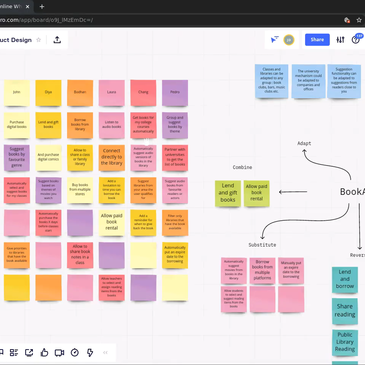



![Brutally Honest UI/UX Reviews [LIVE]](https://i.ytimg.com/vi/-Rr2J16orfA/mqdefault.jpg)

![Refactoring YOUR Designs [LIVE]](https://i.ytimg.com/vi/NG_NgSDCOi8/mqdefault.jpg)
Related Reads
📰
📰
📰
📰
Measuring UX When AI Is Unpredictable: New Metrics
Medium · AI
Measuring UX When AI Is Unpredictable: New Metrics
Medium · UX Design
Hooked: How to Build Habit-Forming Products — The Psychology Behind Apps You Can’t Stop Using
Medium · UX Design
React Native vs New Alternatives: What’s Next?
Medium · Programming
🎓
Tutor Explanation

 DeepCamp AI