
Creating Responsive Websites for Any Device
Skills:
UI Design90%
Key Takeaways
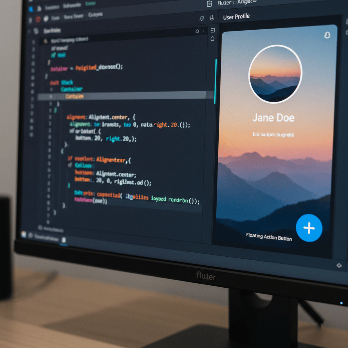
Creating responsive websites using Flexbox, Grid, and media queries
Original Description
In this course your web design skills go from good to great. This course is all about responsive design—creating layouts that look just as killer on a smartphone as they do on a desktop. You’ll dive into Flexbox and Grid, the CSS superheroes that make flexible, adaptive designs possible. And with media queries, you’ll fine-tune every pixel, making sure your sites look sharp no matter the screen size.
But it’s not just about the code. This course gives you hands-on experience designing for real-world audiences. You’ll test, optimize, and learn best practices for making accessible, visually appealing layouts that stand out. By the end, you won’t just know how to code responsive sites—you’ll know how to think like a pro designer, giving users the best experience on any device.
Watch on External: Coursera ↗
(saves to browser)
Sign in to unlock AI tutor explanation · ⚡30
More on: UI Design
View skill →


Related Reads
📰
📰
📰
📰
Why Vanilla JS?
In the article below, I am sharing my story of building SaaS product in vanilla js and explaining why I decided to go with this approach.
https://guseyn.com/html/posts/why-vanilla-js.html
Dev.to · Guseyn Ismayylov
How to Create a Cursor Tail Using HTML, CSS, and JavaScript
Medium · JavaScript
I built a landing page with Three.js, vanilla JS, and zero frameworks — here's what I learned
Dev.to · Ayush Shekhar
Part 1: Why I Rarely Use useEffect Anymore (and what I use instead)
Dev.to · Alejandro
🎓
Tutor Explanation
 DeepCamp AI