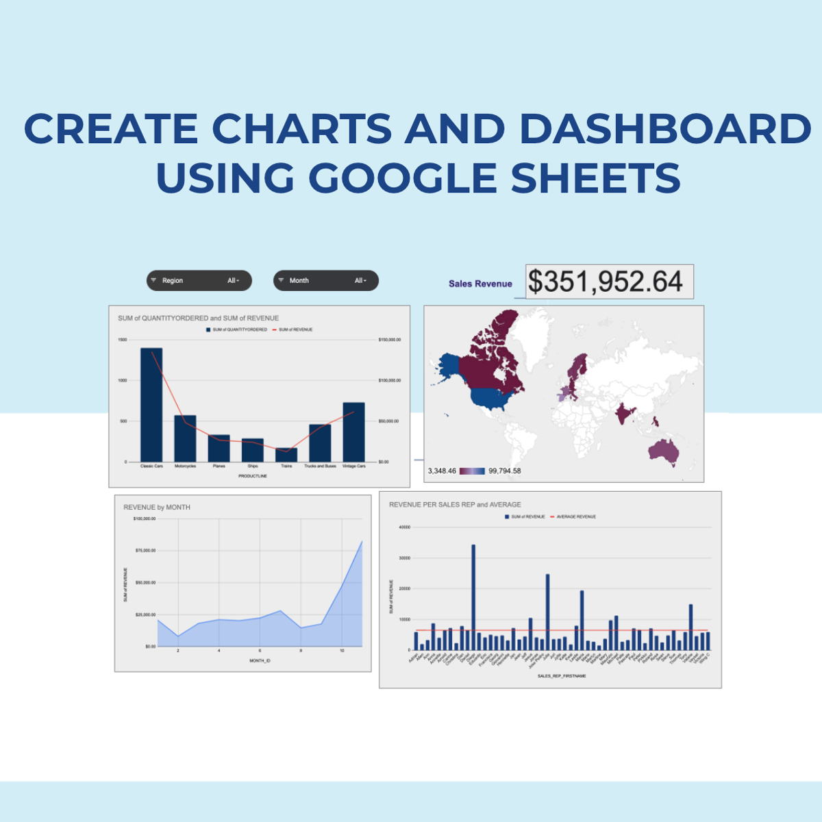
Create Charts and Dashboard using Google Sheets
Skills:
Data Literacy80%
Key Takeaways
Creates charts and a dynamic dashboard using Google Sheets
Original Description
In this 2-hour long project-based course, you will learn how to create effective charts and a dynamic dashboard to visualize data sets. You will be able to work with vlookups, pivot tables and basic formulas and be able to create dynamic charts, sparklines, and a robust, dynamic dashboard to present the data.
By the end of the project you will be able to:
- Understand the terminologies of spreadsheets
- Work with basic formulas in Google Sheets
- Create 8 Basic Charts for visualizing data
- Generate Dynamic Charts from a dropdown list
- Generate Sparklines to represent data
- Build a dashboard and introduce Basic and Advanced Charts
- Use Slicers to filter data and create a robust and dynamic dashboard
Note: If you don't have a Google account, you will need to create one to be able to complete the content.
Watch on External: Coursera ↗
(saves to browser)
Sign in to unlock AI tutor explanation · ⚡30
More on: Data Literacy
View skill →









Related Reads
📰
📰
📰
📰
Tracking Macroeconomic Indicators with the Finance Toolkit
Dev.to · Jeroen Bouma
Pydantic for Data Engineering: Schema Validation in ETL & Pipeline Contracts
Dev.to · Gowtham Potureddi
Half of Data Engineering Jobs on LinkedIn Aren't Real
Dev.to · DataDriven
Evolutionary Data Through Schemaboi: Achieving Forward, Backwards, and Sideways Compatibility
InfoQ AI/ML
🎓
Tutor Explanation

 DeepCamp AI