Business Intelligence & Data Visualization in Excel
Key Takeaways
Using Excel Business Intelligence tools for data analysis and visualization
Original Description
Master Excel Business Intelligence tools to analyze data, create visual insights, and support better business decisions. Learn how to transform raw data into meaningful reports and dashboards.
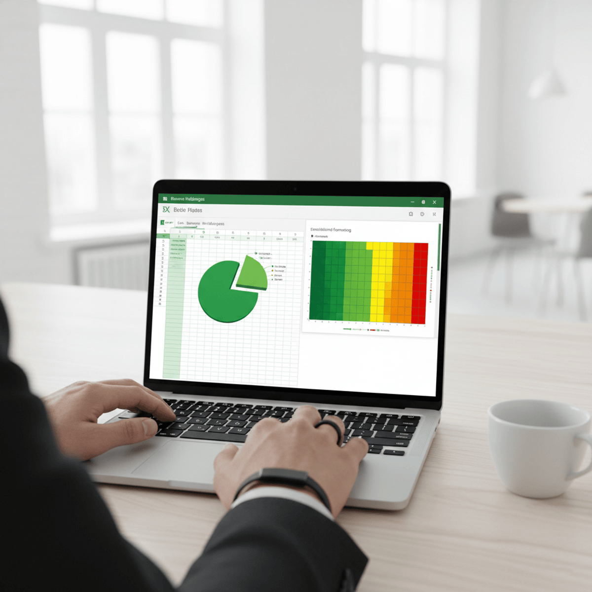
This course provides a structured, hands-on approach to data analysis and visualization using Microsoft Excel. You will learn how to organize datasets, apply advanced sorting and filtering, and use conditional formatting to highlight key insights.
Through practical modules, you will build professional charts, create dynamic Pivot Tables, and perform multi-level data analysis for business reporting. The course also covers what-if analysis techniques using data tables, enabling you to evaluate different scenarios and support strategic decision-making.
By the end of the course, you will be able to analyze complex datasets, design visually compelling reports, and generate actionable insights using Excel BI tools.
Ideal for students and professionals, this course equips you with job-ready skills in data analysis, reporting, and business intelligence using Excel.
Watch on External: Coursera ↗
(saves to browser)
Sign in to unlock AI tutor explanation · ⚡30
More on: Data Literacy
View skill →









Related Reads
📰
📰
📰
📰
Could Satellite Data Help Some Communities Monitor Air Pollution?
Forbes Innovation
The Oldest Decision in Agriculture, Made With a New Instrument
Medium · AI
Python Excel Automation: Create, Edit, and Format Text Boxes
Medium · Programming
From Spreadsheets to Spark: Why Traditional Analytics Tools Reach Their Limits
Medium · Data Science
🎓
Tutor Explanation

 DeepCamp AI